Project Background:
This case study focuses on understanding the experiences of users that own
a premium subscription plan with a media platform.
This case study focuses on understanding the experiences of users that own
a premium subscription plan with a media platform.
RHYTHM Hi-Fidelity Screens
Introduction
Over the past decade, subscription services have significantly risen in popularity and become a new normal for consumers. On average, a consumer owns between two and three subscriptions according to a news article published by the Washington Post in 2021. Additionally, subscriptions have boomed during the pandemic. Although premium subscriptions offer features that enhance the experience of services, there are factors that contribute to challenges for subscribers. Therefore, this case study focuses on the experiences of premium subscription holders as well as ascertaining potential solutions to existing user pain points.
In order to understand the pain points of premium subscription holders, a screener survey was created and delivered to fifteen people. The goal of the screener survey was to identify the platforms that people used on a regular basis and which of those platforms the participants had an active premium subscription with. The platforms that were included in this study were Youtube, Spotify, Apple Music, Pandora, and SoundCloud. According to findings from the survey, 100% of survey takers shared they used Youtube. 66.7% of participants utilized Spotify, 33.3% used SoundCloud, 13.3% of participants shared they used Apple Music, and 13.4% of participants used other media services. These percentages changed significantly when users were then asked to identify the service they held a premium subscription with. According to the data acquired, The percentage of individuals that owned Youtube Premium was 46.7%. Contrarily, 60% of individuals were Spotify premium members. The percentage of premium users of Apple remained the same at 13.3%.
The Problem
According to the data gathered from the surveys it became apparent that the most favored platforms among participants were Spotify and Youtube. Once this information surfaced, it was important to learn more about the users experiences with these platforms as premium members. During this process, the frustrations individuals experienced became apparent. One of the issues identified was the lack of access to content. One user mentioned that there is a lack of particular genres of music on Spotify which resulted in them having to refer to Youtube to listen to them. Another user shared “It’s hard to find content I like because sometimes smaller creators aren’t recommended as often” in regards to Youtube Premium.
Furthermore, an additional frustration that premium members experienced was due to the lack of control and customization of their feeds. One user expressed “I wish the music was curated for me more” and discussed how Youtube Music only allowed for the creation of a Radio and not personalized playlists. This was frustrating for the user because even if they “disliked” a song, Youtube would still display that song to the user again which prompted the user to “dislike” the song again in hopes that it would not reappear. Ultimately, this information indicated that while users could enjoy premium benefits such as ad-free content, there was a desire for users to gain more customization control over their digital experiences.
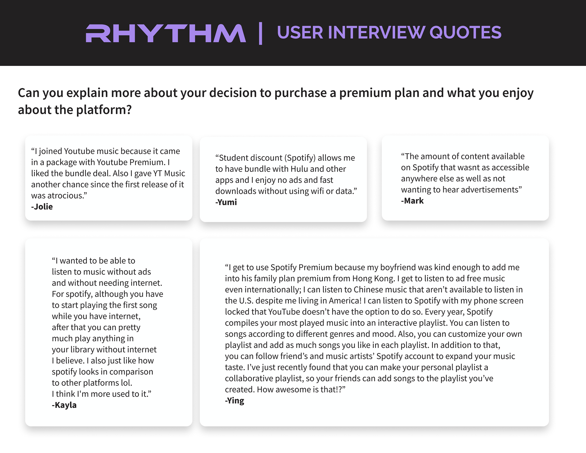
RHYTHM User Interview Quotes
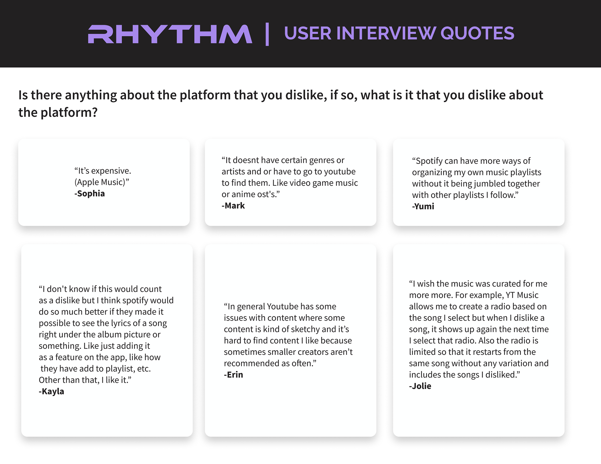
RHYTHM User Interview Quotes
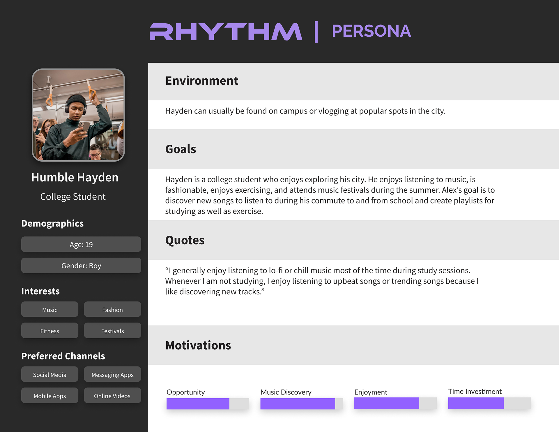
RHYTHM Persona
Forming HMW Statements
Once this discovery was made, generating a How Might We (HMW) statement was important to create space for the ideation of potential solutions. The statement was “How might we help users further customize their digital experience?”. After the creation of the HMW, a sitemap was produced to ensure the essential pages of the Rhythm app were designed. Once that was completed, a user flow was developed to map out the actions a user could take as they navigate within the app. This was then followed by the development of lo-fidelity wireframes and the first rounds of usability testing.
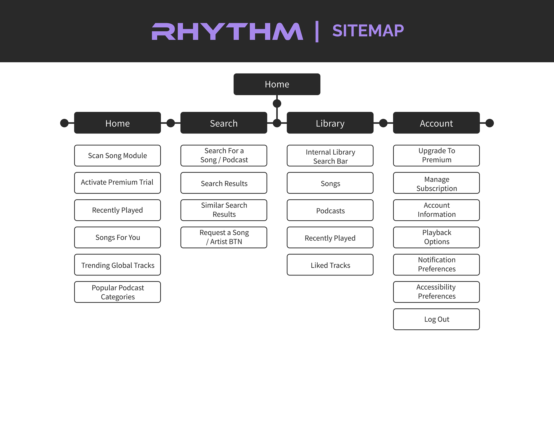
RHYTHM Sitemap
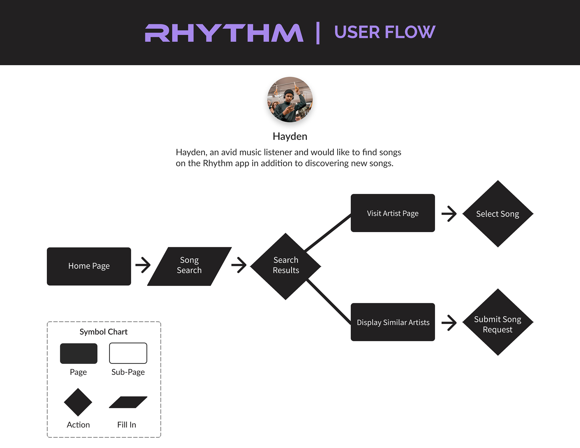
RHYTHM User Flow
Initial Findings from Usability Testing
During the first round of usability tests, users were presented with a lo-fidelity prototype and a list of prompts as they navigated the Rhythm app. These sessions ran for thirty minutes each and were essential to understanding which areas needed improvement and this procedure led to three key takeaways. During the onboarding process, users struggled to locate the sign-up button which was initially on the bottom of the screen. Observing users who failed to locate the sign-up button led to the decision to make the first screen a sign-up screen instead of a log-in screen.
The second takeaway that was acquired from these usability tests was that users enjoyed the fact there was an option to view lyrics. However, although users could view song lyrics, the lyrics module was too small in size initially. Also, the lyrics module completely blocked the album art which users wanted to be able to view. When asked about the reason behind wanting to view the album art with the lyrics, one user said, “Viewing album art allows you to immerse yourself with the band”. This finding was the rationale behind my new plan to enlarge the lyrics module and lower its transparency in order to increase the visibility of the album art.
Within the lo-fidelity prototype, there was also a particular screen that contributed to the third takeaway. The screen was the second search results page which featured zero search results with text that read “Sorry it looks like we do not carry songs or episodes from this artist.” This screen was a major pain point for users who expressed feelings of disappointment. One user said, “this page makes me feel sad.” This feedback motivated me to improve this page by including a button that communicates to the user that they can request songs and artists as a premium subscription member. Additionally, instead of displaying the previous text, it was replaced with text that read “similar results” with images of other artists in the search results.
RHYTHM Lo-Fidelity Screens
The Solution
For the second round of usability testing, users were presented with a hi-fidelity prototype of the Rhythm app.
An additional three key insights were discovered from the usability testing sessions. The first key insight was
that users were hesitant to consider upgrading to a premium version of the Rhythm app. Therefore they expressed how they would like to have access to a premium plan before investing money. This feedback
enabled me to understand the importance of free trials for users. To improve the design further, instead of including text that read “get premium”, the text on the premium modules was replaced with to “activate free trial”.
This communicates to users that they can experience premium features for themselves for a trial period.
As for the second key insight, this was discovered on the play screen where users could “listen” to a song
track. Users expressed their amusement with the lyrics option since it was larger and had enough transparency where both the lyrics were legible and the album art was visible. However, many users struggled with closing
the module due to no visual indicators on how to close it once they reached the bottom where the last lyrics
of the song were located. Therefore instead of only including an ‘x’ mark at the very top of the lyrics module,
a ‘close’ button was also included at the bottom of the modules to inform the users that they had two options
to exit lyrics mode. In regards to the third insight, users who had ‘followed’ an artist during the usability test communicated their wishes to be able to access their list of artist(s) they were actively following. This was
not a factor that was considered upon initially designing these screens and it was a crucial discovery. To
improve the design, another section was designed for artists a user follows and is accessible on the users personal library page.
Lastly, a couple of other elements that were necessary to implement in the design were visible buttons for playlist creation and queue-ing songs. One user expressed “It’s difficult to always search for the add to playlist button or queue button”. Furthermore, it was important to allow users the option to remove or hide songs they did not want to reappear before them. This was necessary because users shared there have been many times they had “disliked” a song however, it would still reappear.
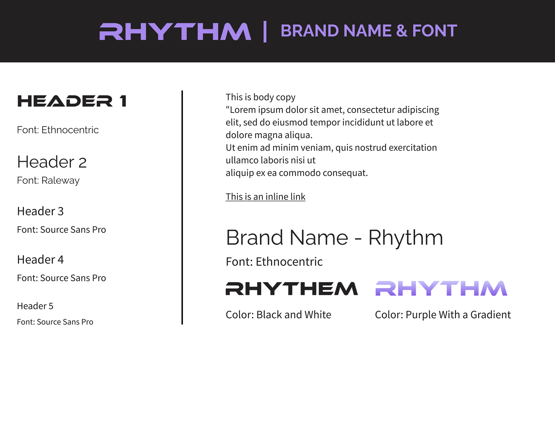
RHYTHM Style Guide
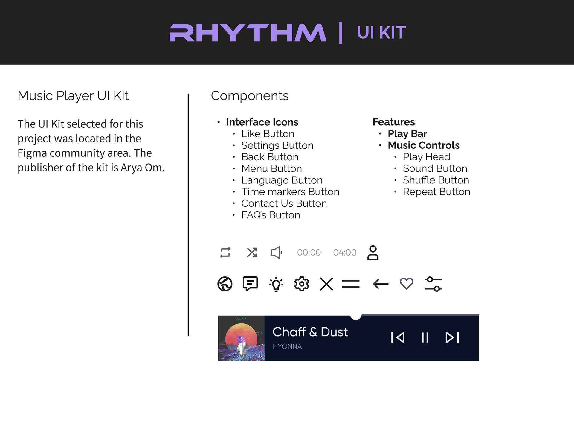
RHYTHM UI Kit
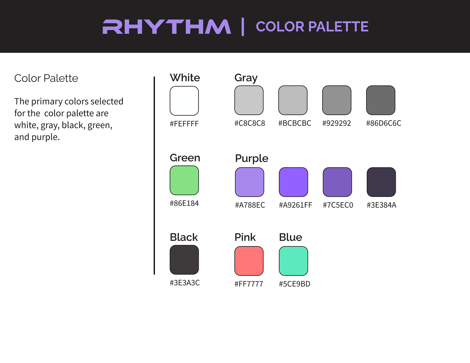
RHYTHM Color Palette

RHYTHM Mood Board
RHYTHM Hi-Fidelity Screens
Takeaways
One of the biggest takeaways from this process was learning how the number of premium users and subscription-based services is increasing in today’s world. Acquiring this data during the research phase
allowed for this understanding and has increased my interest in designing solutions for users with subscriptions. Furthermore, another key takeaway from this experience was recognizing the importance of remaining curious. Although the lo-fidelity wireframes were based on both the sitemap and user flow, user testing was a valuable experience that informed me of the users actual goals, thoughts, and desires. Ultimately, usability testing reinforced the importance of remaining curious and unbiased during the UX process when designing solutions.
allowed for this understanding and has increased my interest in designing solutions for users with subscriptions. Furthermore, another key takeaway from this experience was recognizing the importance of remaining curious. Although the lo-fidelity wireframes were based on both the sitemap and user flow, user testing was a valuable experience that informed me of the users actual goals, thoughts, and desires. Ultimately, usability testing reinforced the importance of remaining curious and unbiased during the UX process when designing solutions.
RHYTHM Walkthrough
