Project Background:
This UX case study centers around discovering a better way to improve the
studying experiences of Japanese language learners.
This UX case study centers around discovering a better way to improve the
studying experiences of Japanese language learners.
Dandan Promotional Video
Dandan's Hi-fidelity screens
Introduction
Over the years, Japan has become a popular tourist destination for its culture, food, scenery, and events which in turn brought an increased interest in learning Japanese in America. According to an article published in 2018, Japanese has become the fifth most studied language in America. As a Japanese language learner myself, I was inspired to design an experience for other learners of the language. Therefore, this UX case study centers around the experiences of Japanese language learners to discover how to bridge the gap between students and language learning apps.
The Problem
In order to create solutions to a problem, it is important to define that problem first. Therefore, conducting secondary research was my first step to learning more about the problems students studying Japanese face. Second-language acquisition requires time, effort, and motivation. In addition to lessons with a sensei, many students attempt to reinforce their knowledge through language apps. However, one of the primary limitations of language learning apps is the lack of interaction which results in a loss of motivation to use them. For this reason, students also struggled to find additional resources to aid them in their studies. After defining this problem, it became my mission to better understand these users. Therefore, constructing a research plan was the next step.

Problem statement quote
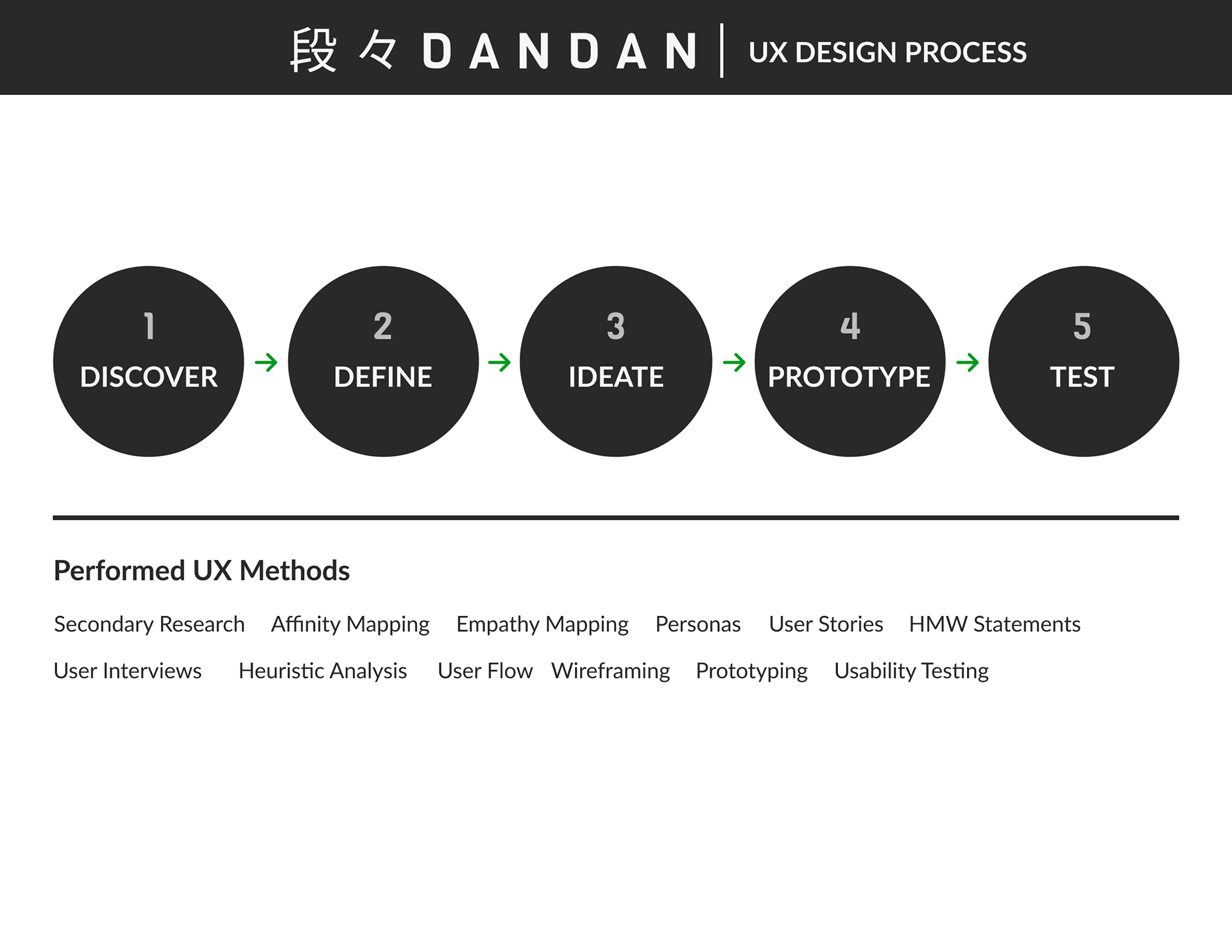
An image of the UX design process

An image of user interview quotes from user interviews
Forming UX Research Questions
Developing a research plan was the next step to determine project goals and answer the primary question. "What methods can be implemented to improve the studying experience and engage language learners?" In addition to developing more research questions, it was important to configure recruiting methodologies, identify a target group, compose interview questions, and set a project timeline.
Research Questions:
•What motivates users to download a Japanese language learning app?
•What causes disinterest in the language learning app?
•How are users interacting with these apps and how long do they use them?
•When and where would these users benefit the most from using these apps?
•How are the current language learning apps underserving their users?
User Interviews and Findings
After distributing and receiving responses on my screener survey, Conducting user interviews was the next necessary step during the discovery phase. The users that participated in my interviews enabled me to understand more about their study habits, motivations, challenges, and reasons for downloading the language learning apps they used among many more valuable pieces of information. After reviewing the information acquired from the interviews, the pain points of the users became apparent.
User Pain Points
•Absence of immersion
•Irrelevant lessons
•Lack of content for their proficiency levels
To develop further insights, it was crucial to create an affinity map and identify similar themes to better understand what the users truly desired.
User Pain Points
•Absence of immersion
•Irrelevant lessons
•Lack of content for their proficiency levels
To develop further insights, it was crucial to create an affinity map and identify similar themes to better understand what the users truly desired.

An image of the Affinity Map
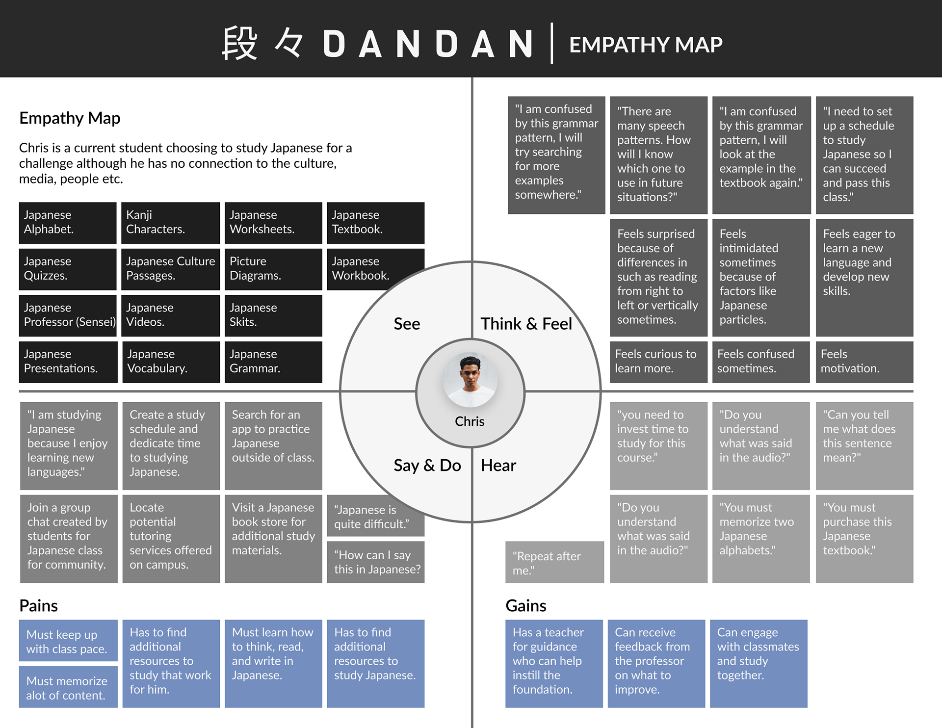
Seeing from the Users Perspectives
After the insights were crystal clear, the next step was to create an empathy map to see things from the users point of view. This led me to identify two types of users to base the empathy maps around. The first user type was a person who was completely new to learning Japanese. The second user type was a person who has had prior experience learning Japanese. Putting myself in the shoes of these users allowed me to consider the things I might see, think, do, feel, and hear as the user and also understand that the users actions don’t always align with what they say or think.

User Type One
User Type Two
Persona'fication
After synthesizing and combining all of the information acquired from the user interviews, the affinity map, and the empathy maps, it was time for persona’fication or in other words, time to develop user personas using the attributes, habits, and quotes of the users I interviewed. Creating user personas was important because they are a core component of user-centered design. Get ready to meet ambitious Alex, clever Chris, and Nifty Naomi! Originally they were illustrations created in Adobe illustrator however, ultimately replacing their icons with the image of a person who fits their description allowed me to further empathize with them even more.
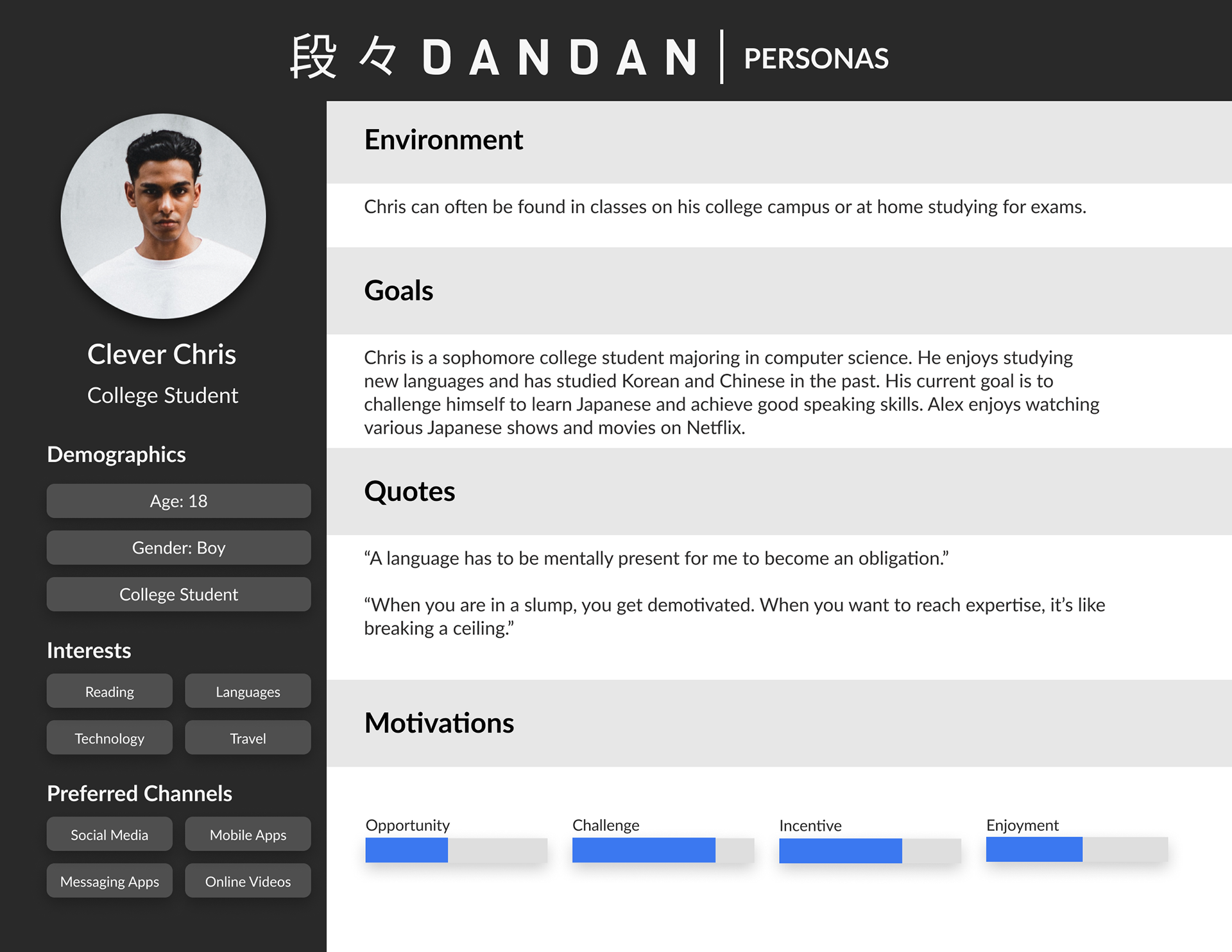
An image of Clever Chris' Persona
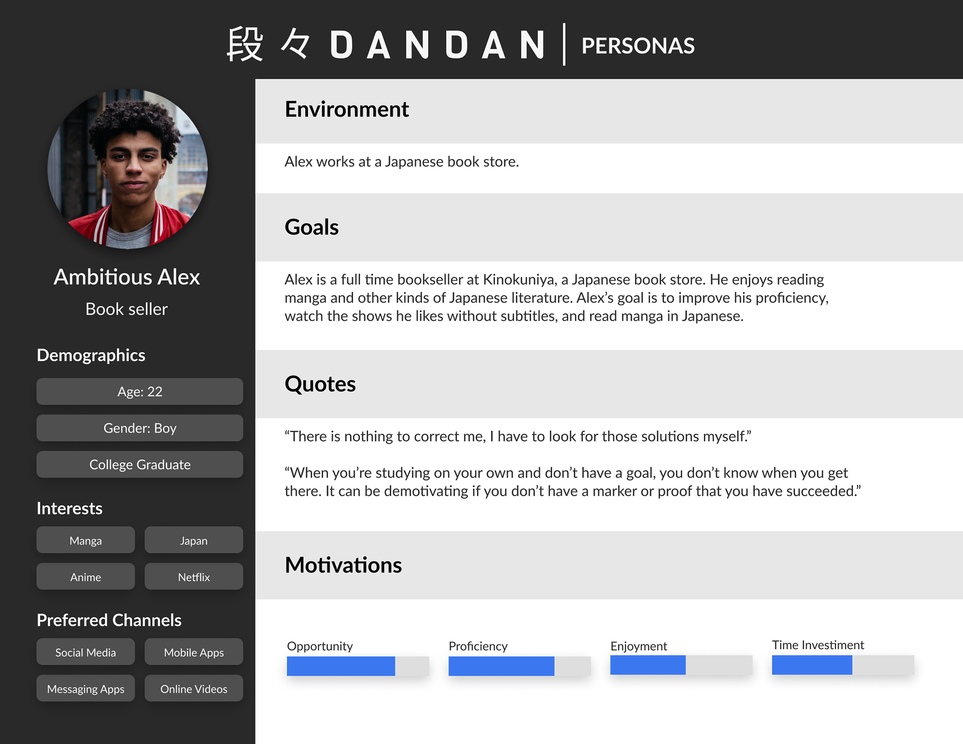
Ambitious Alex Persona
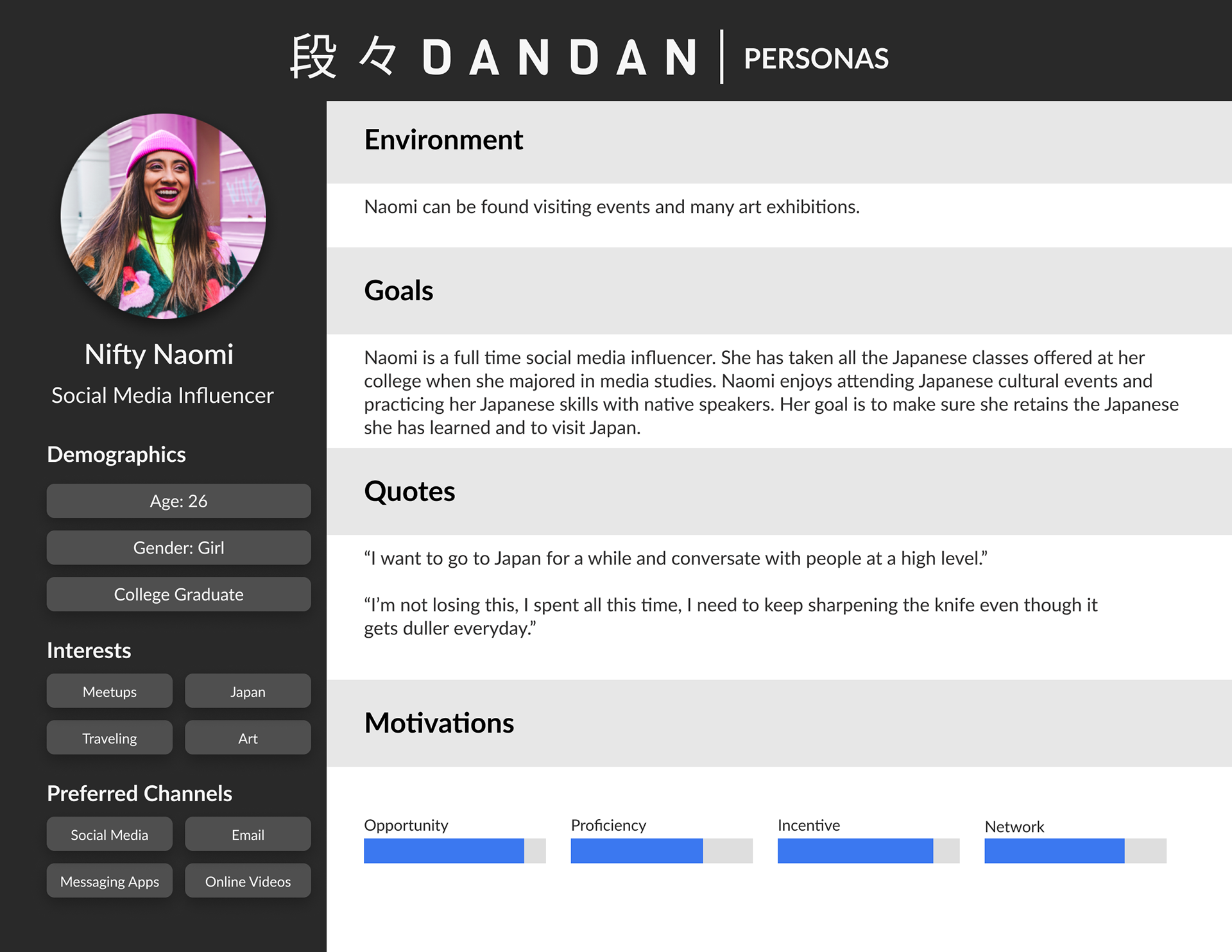
Nifty Naomi Persona
HMW Statements
The final step of synthesizing my research was developing How Might We (HMW) statements. By creating HMW statements it enabled me to clearly articulate the problem areas that users were experiencing which was the goal of this research. Furthermore, the HMW statements offered the opportunity to ideate potential solutions and it is also why it is an essential aspect of UX/UI design. Once the How Might We statements were composed, it was crucial to decide which ones to identify as solutions for the development of this project. After evaluating the data acquired up to this point as well as project limitations, proceeding with the following statement:
"How might we create an interactive experience for language learners and relieve the confusion they feel when reviewing Japanese they are new to learning?"
"How might we create an interactive experience for language learners and relieve the confusion they feel when reviewing Japanese they are new to learning?"
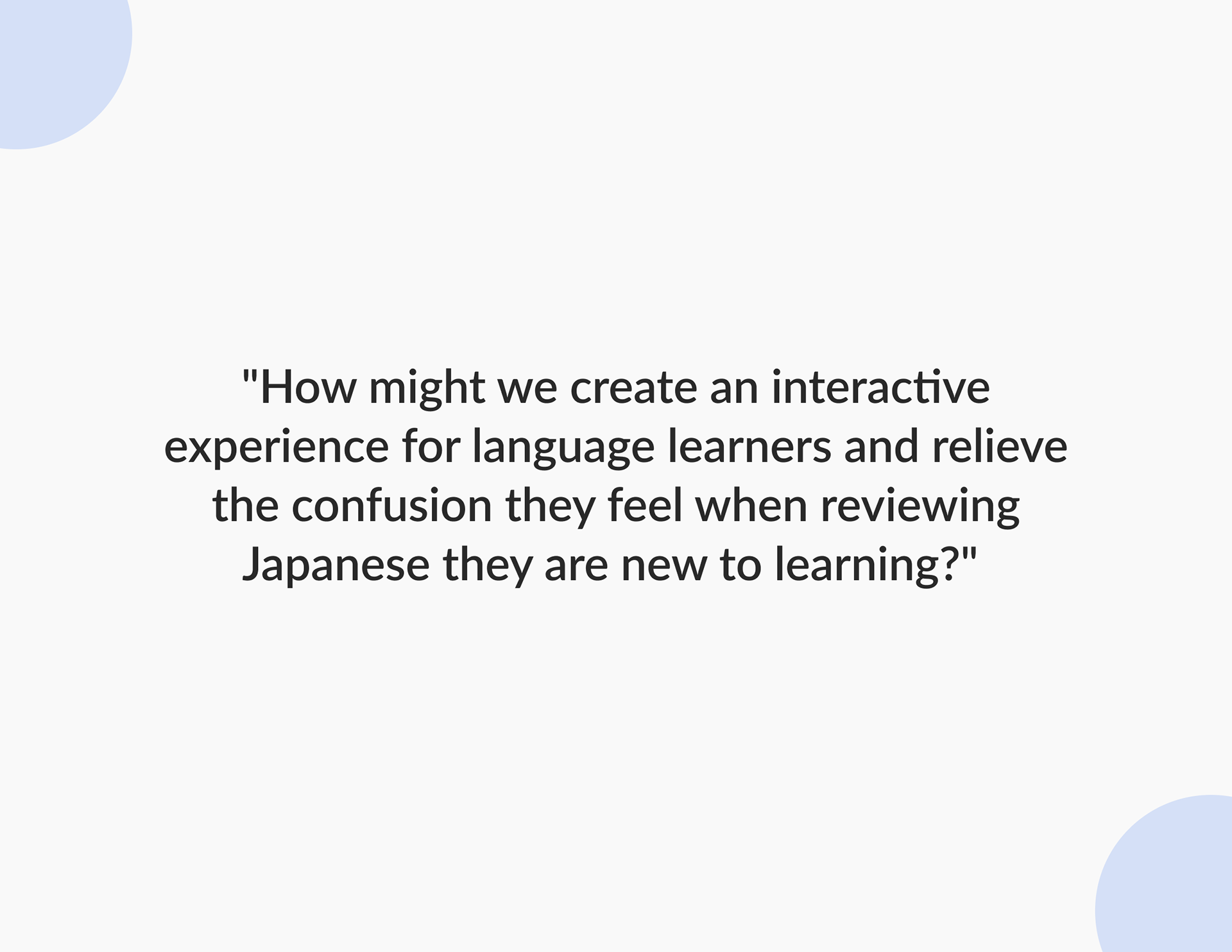
Quote from "How Might We (HMW) Statements"
Heuristic Analysis and Language Learning Apps
After determining which HMW statement to prioritize, conducting a heuristic analysis of other language learning apps was my next priority. The apps selected for the analysis were Duolingo, Memrise, and Busuu because they all feature Japanese lessons and are well known for language learning. The analysis was based on three heuristics.
Heuristics:
•User Control and Freedom
•Consistency and Standards
•Recognition versus Recall
Conducting a heuristic analysis allowed me to understand how the current language learning apps function, identify features that were helpful, and ideate possible solutions to issues that exist in current language apps.
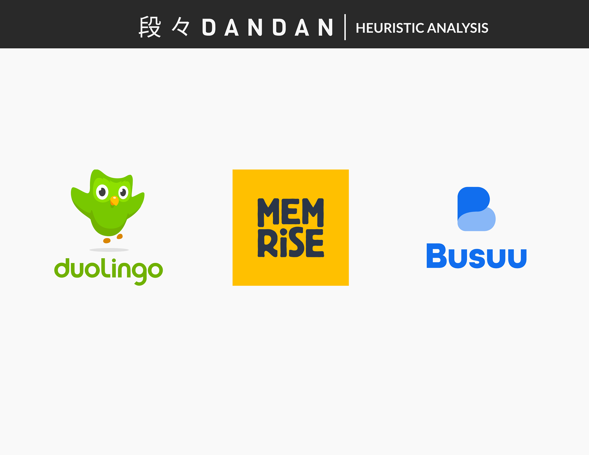
Apps that were selected for the Heuristic Analysis
Creating a Site Map Based on User Stories
After completing the heuristic analysis, it was important to create user stories that allowed for further identification of the functional needs necessary for a Japanese language app. The user stories allowed me to think from the perspective of the personas and create a ranking system using numbers 1-3 to determine high-level, mid-level, and low-level priorities to consider when designing the site map and overall product. Once they were identified, my next step was to create a sitemap which enabled me to determine the most essential pages necessary for users to have access to as well as determine the hierarchy of the design. Once the sitemap was created, designing a user flow became my next priority. A user flow would allow for the visualization of routes that users take to achieve a goal within the product. In this case, the users goal is to learn Japanese. Therefore, creating a red route for the learn page became my mission. Once that was completed, visualization of user flows for the additional pages followed.
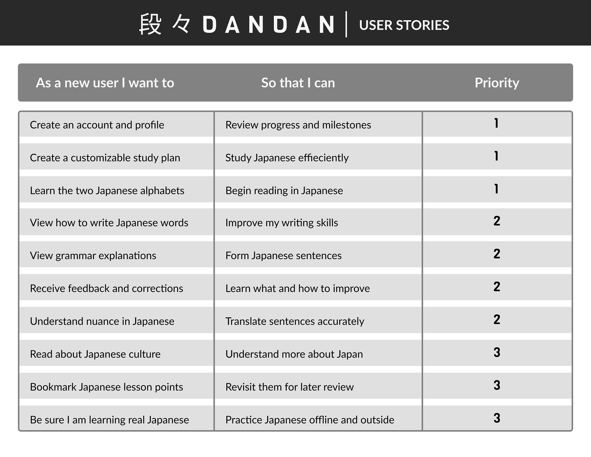
An image of the user stories
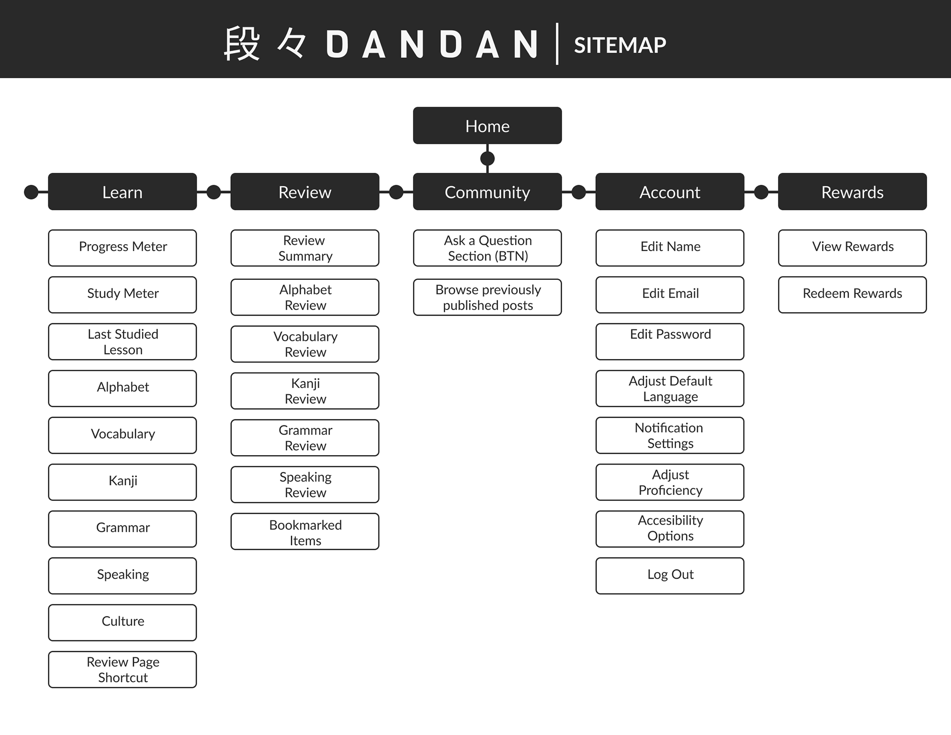
Site Map
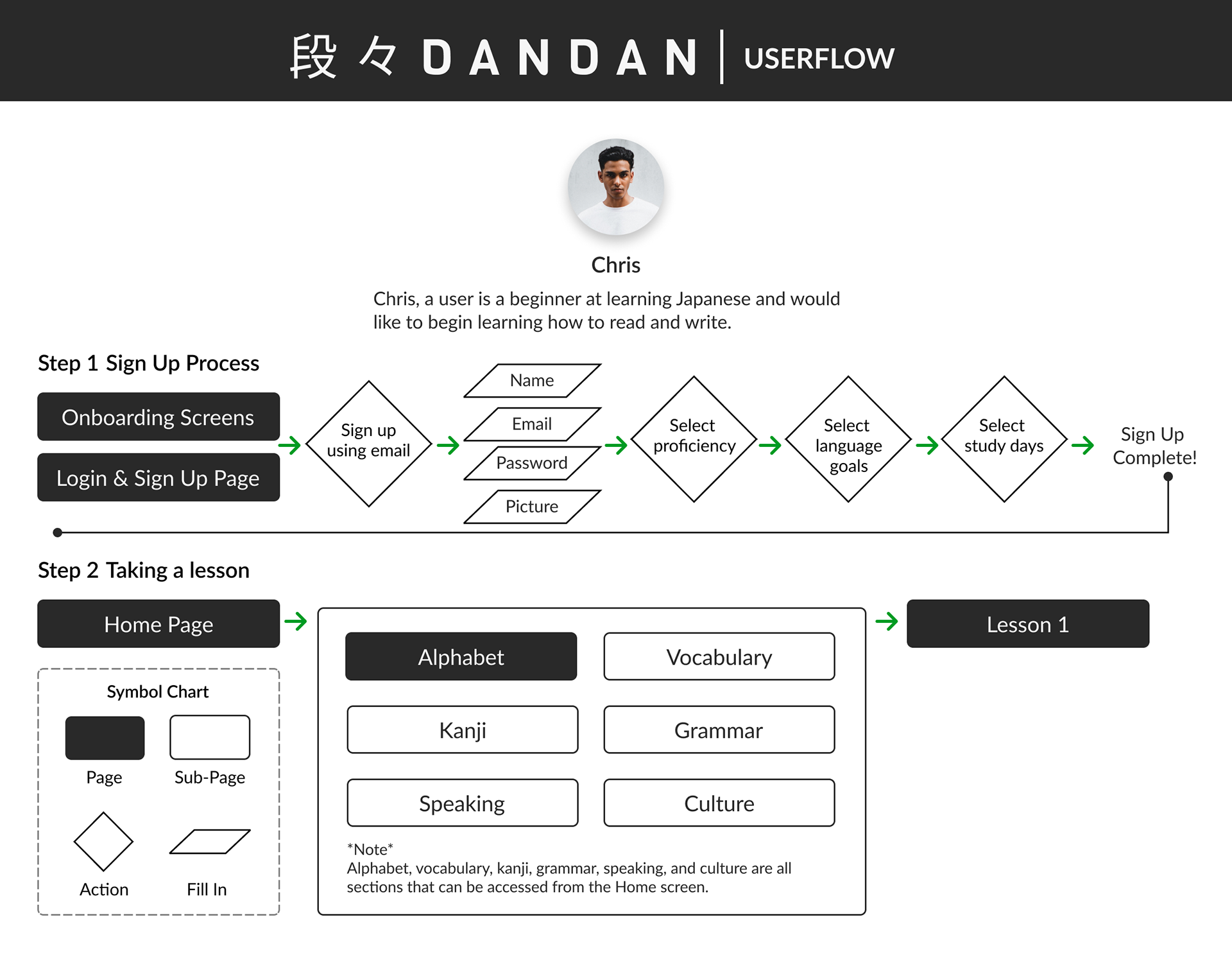
A userflow for a beginner Japanese language learner
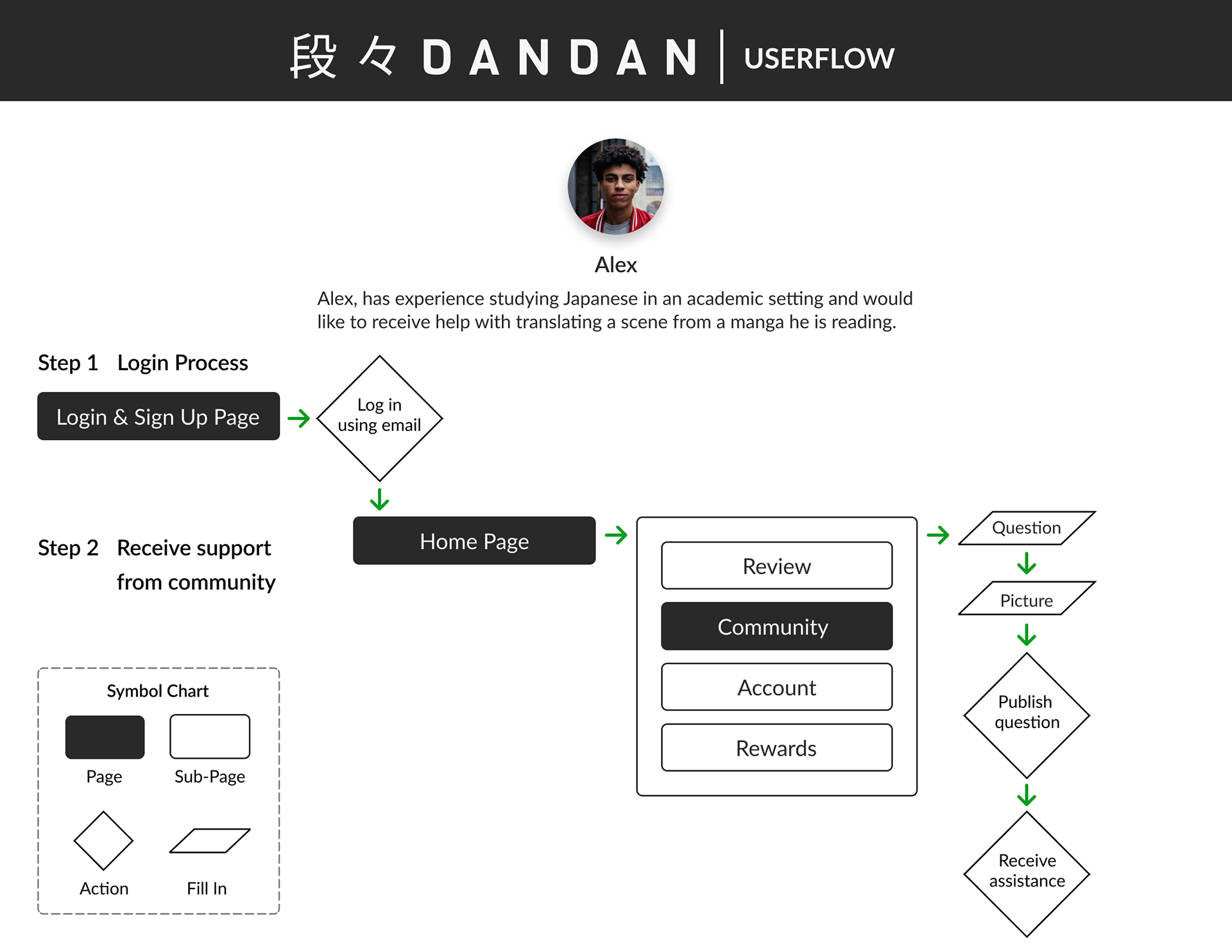
A userflow for a regular user who would like to receive translation assistance for Japanese media
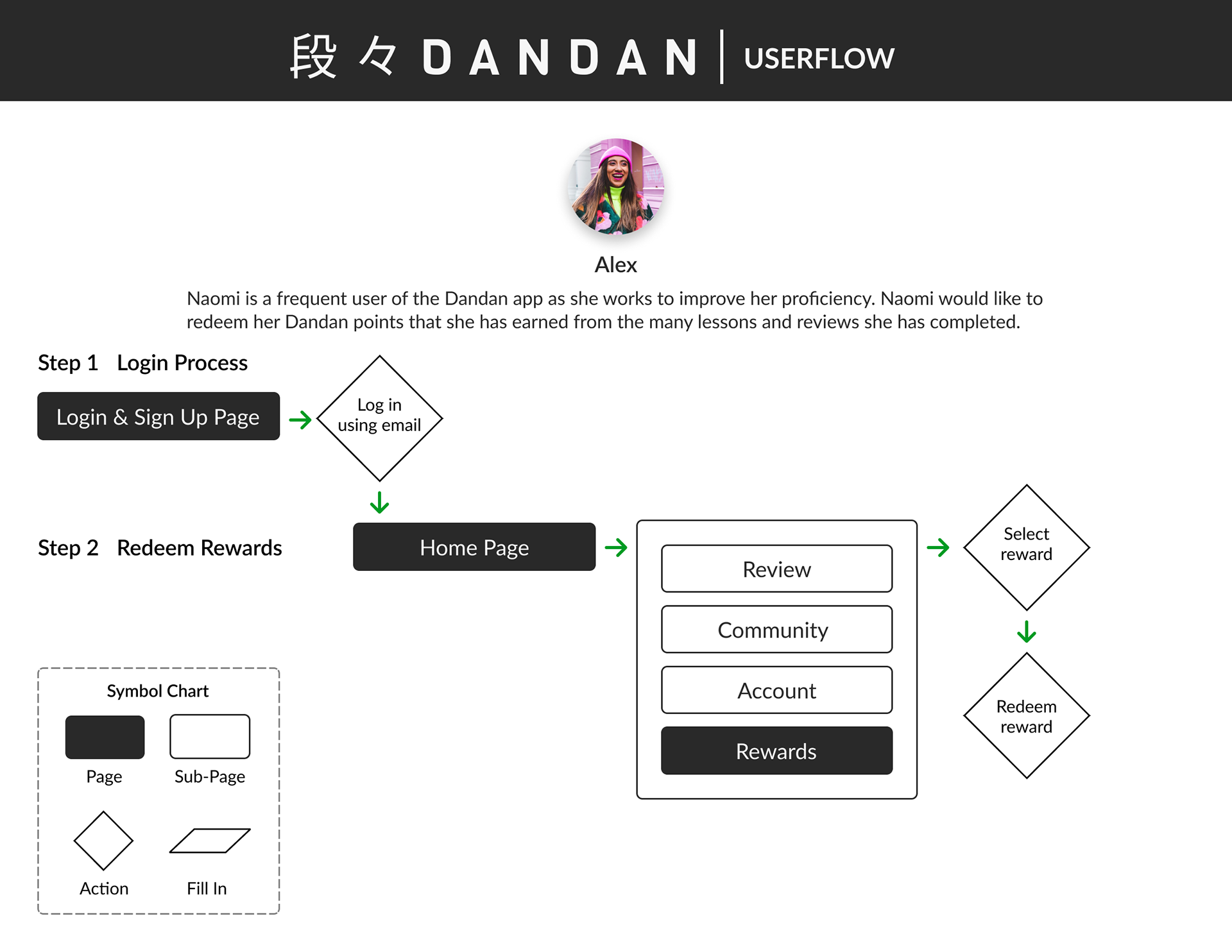
A userflow for a regular user who would like to redeem rewards earned from completed lessons and reviews.
Wireframing from Paper to Digital
After visualizing a site map and user flows, creating sketches was the next step that followed. Sketching was essential to designing the potential layout of the product and mapping the content within the product. After reviewing the sketches, they were recreated digitally in Figma as lo-fidelity wireframes for IOS. The wireframe consists of the learn page which is the landing page for users, a review page, examples of lesson and review sessions, a community page, an account page as well as onboarding screens. Once the lo-fidelity wireframes were completed, the next step of the process was acquiring participants for guerilla usability testing to test the usability, discover insights, and create improvements.
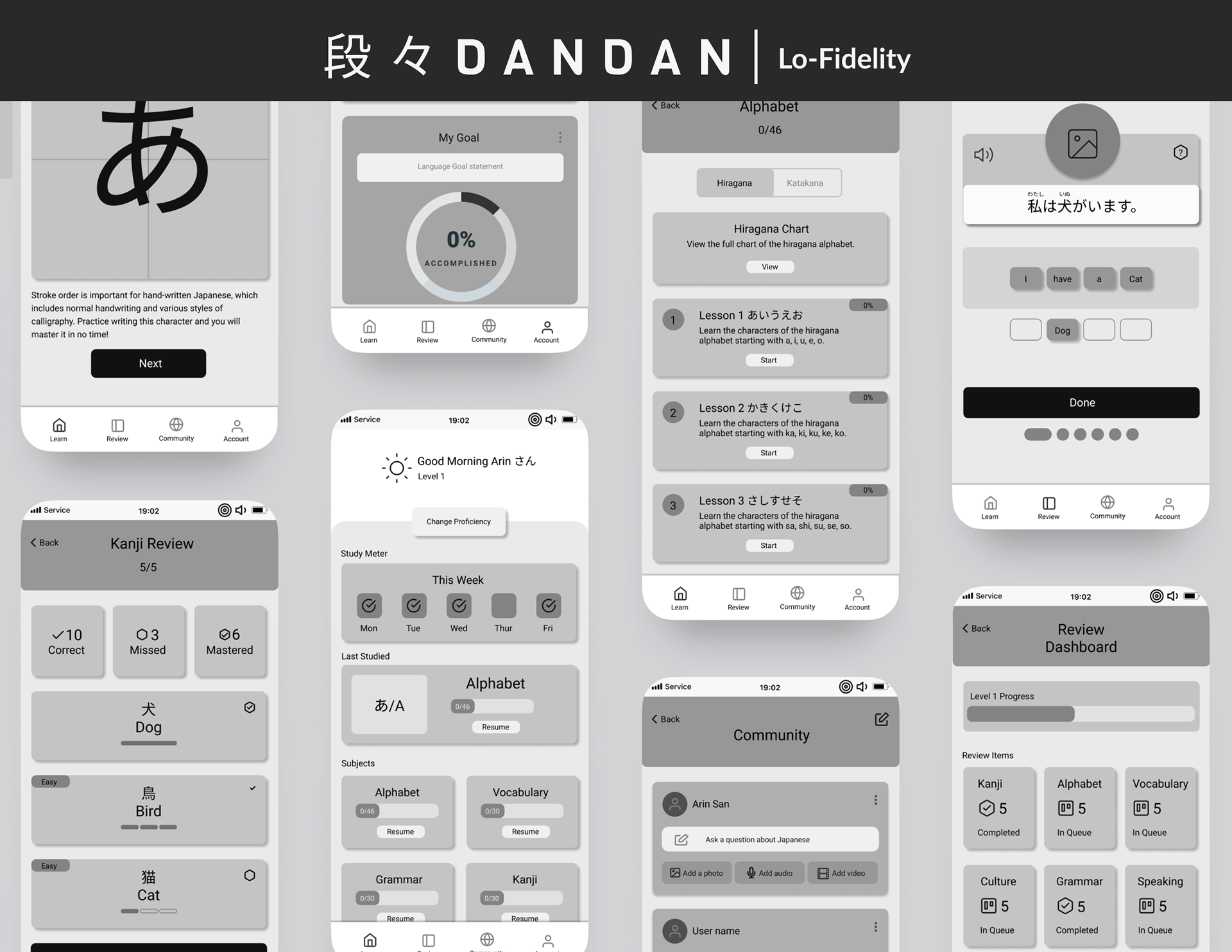
Dandan's Lo-Fidelity Screens
Usability Test Results and Insights
After the usability testing was completed, I acquired many helpful findings that allowed me to empathize with the users and learn what aspects of the app needed improving. The prompt that I had given them was to consider themselves as beginner Japanese language students. When users entered the lesson page, they tried to view the chart of alphabet letters before entering a lesson. That repetitive action reaffirmed the importance of adding that chart in the hi-fidelity prototype. During the alphabet lesson, users tried tracing the letters during the writing practice segment and expressed that they would like to see the stroke order too. Also, another observation made was each tester struggled to locate the review page right away. Upon seeing that, I realized it might serve the user well if there was also a shortcut to the review page on the learn page as well. After these findings were made aware to me, the next step was to implement them and create the hi-fidelity screens.
Development of the Brand Platform
Before creating Hi-Fidelity designs, it was important to establish a style guide for the brand. Therefore, assembling a mood board was the first step that allowed me to define the visual language of the product. Once that was completed, determining factors like the typography, color palette, UI iconography and imagery became my next focus as well as designing the logo. Once the style guide was complete, developing the Hi-Fidelity screens for Dandan became my next priority before conducting the next round of usability tests. This was followed by a Hi-fidelity wireflow displaying Dandan’s red routes.
Dandan's Style Guide Cover
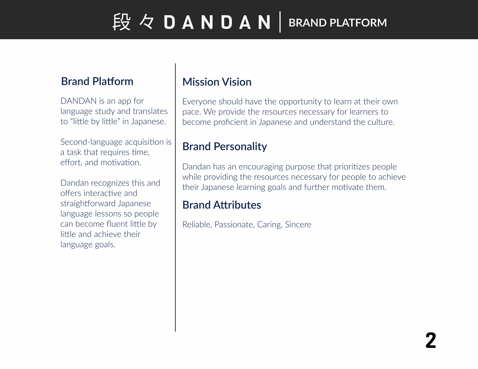
Dandan's Brand Platform descriptions
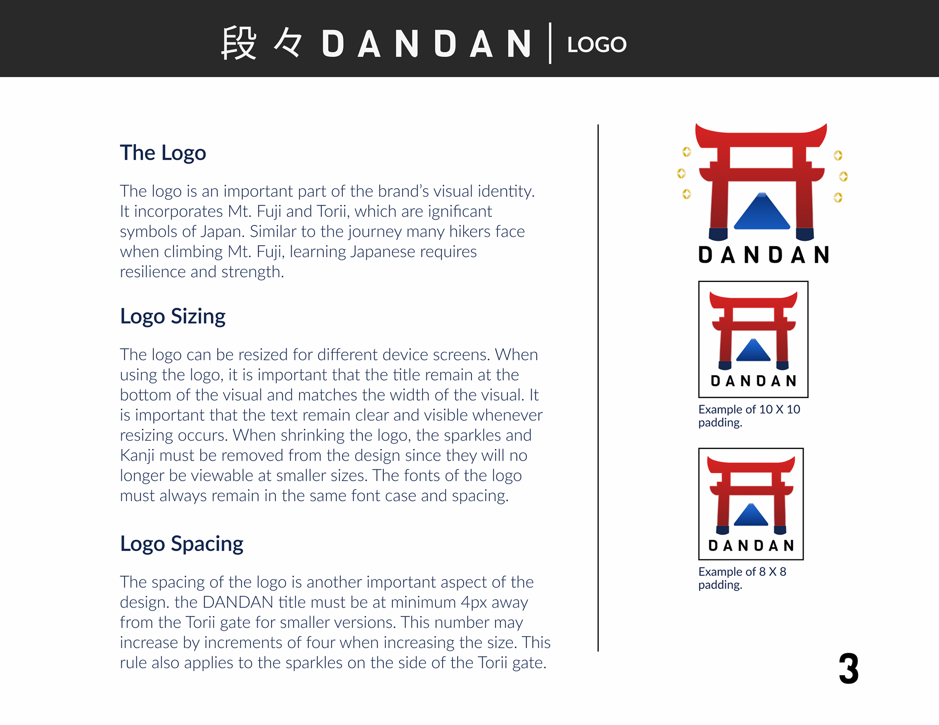
Dandan's logo explanation
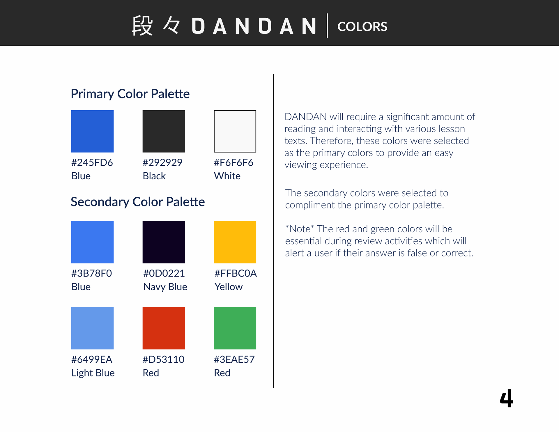
Dandan's color palette explanation
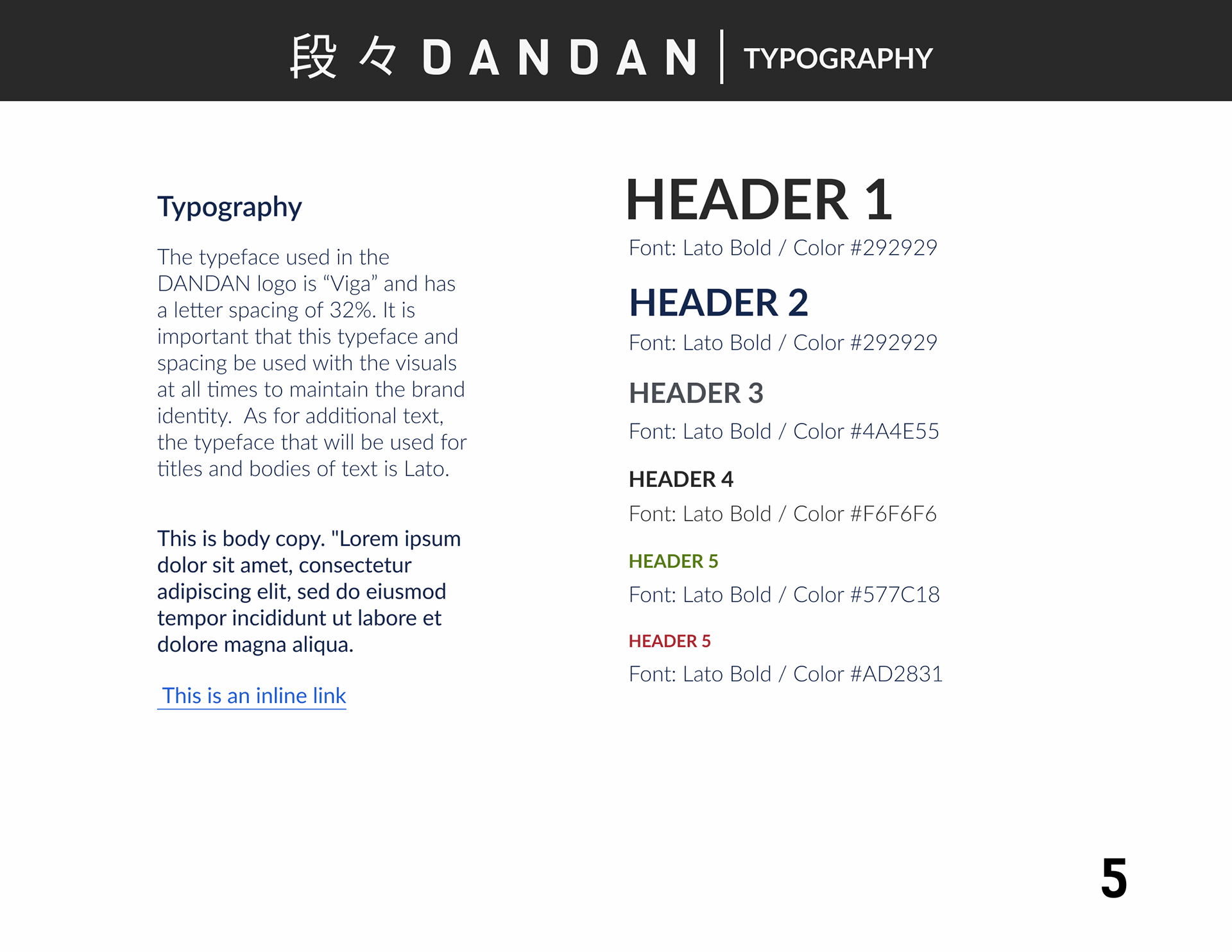
Dandan's Typography description
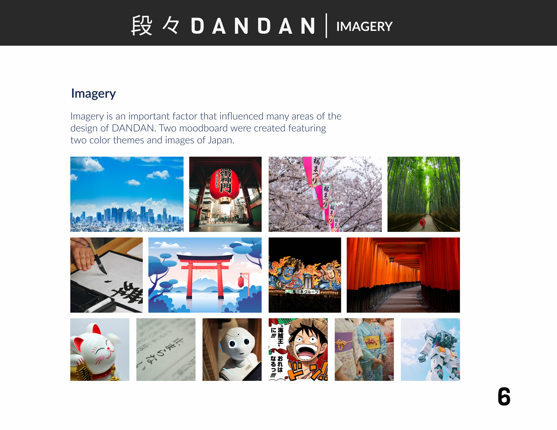
Dandan's imagery explanation
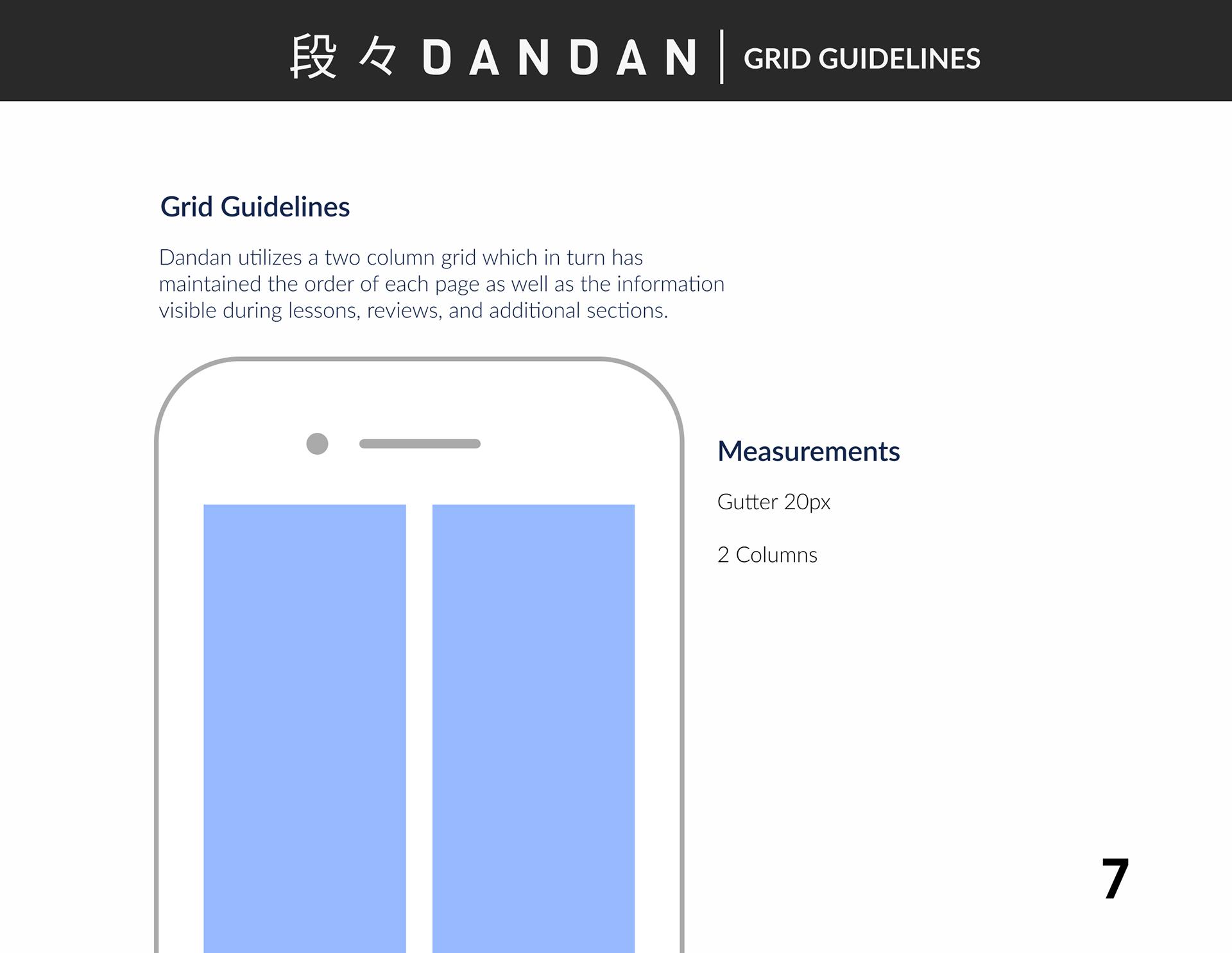
Dandan's grid guidelines
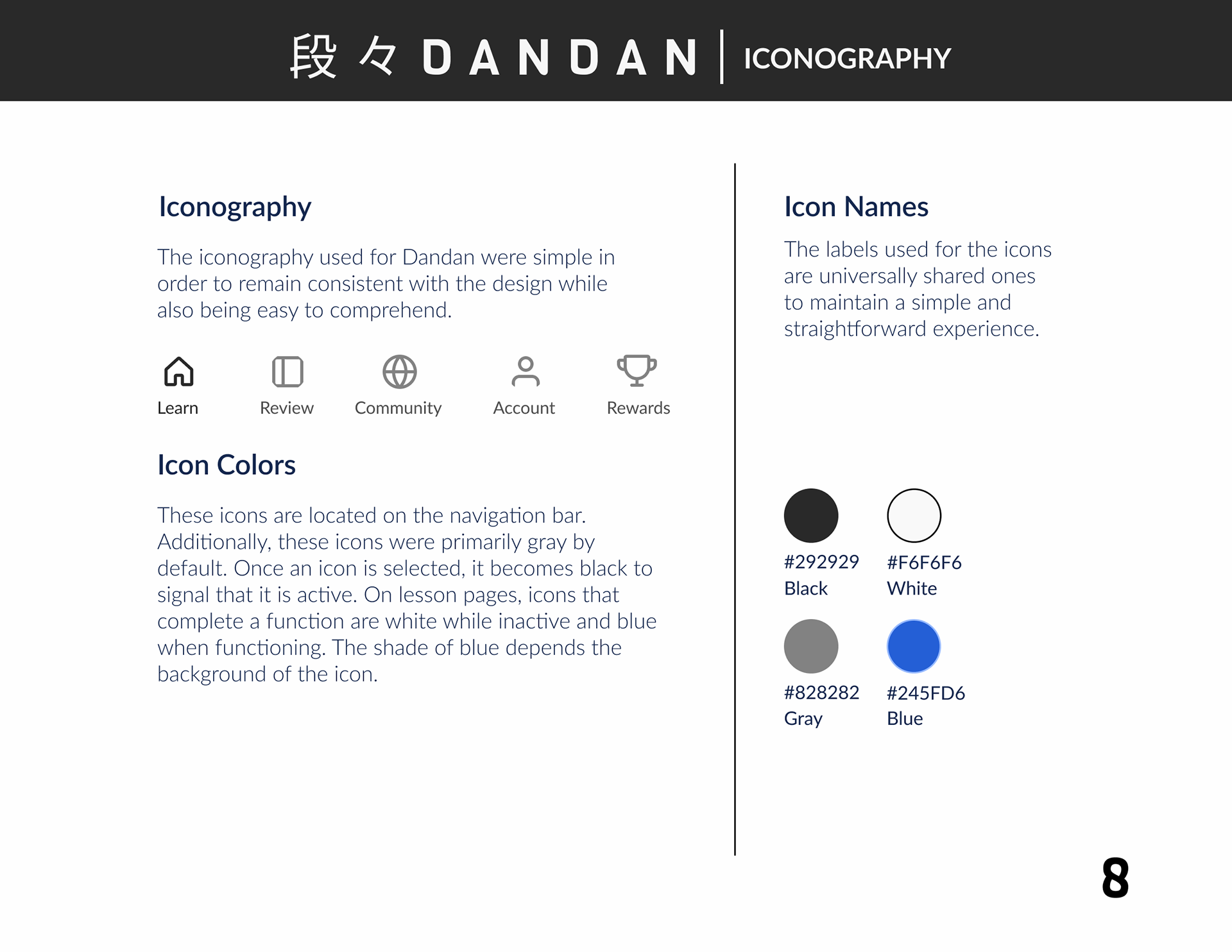
Dandan's Iconography
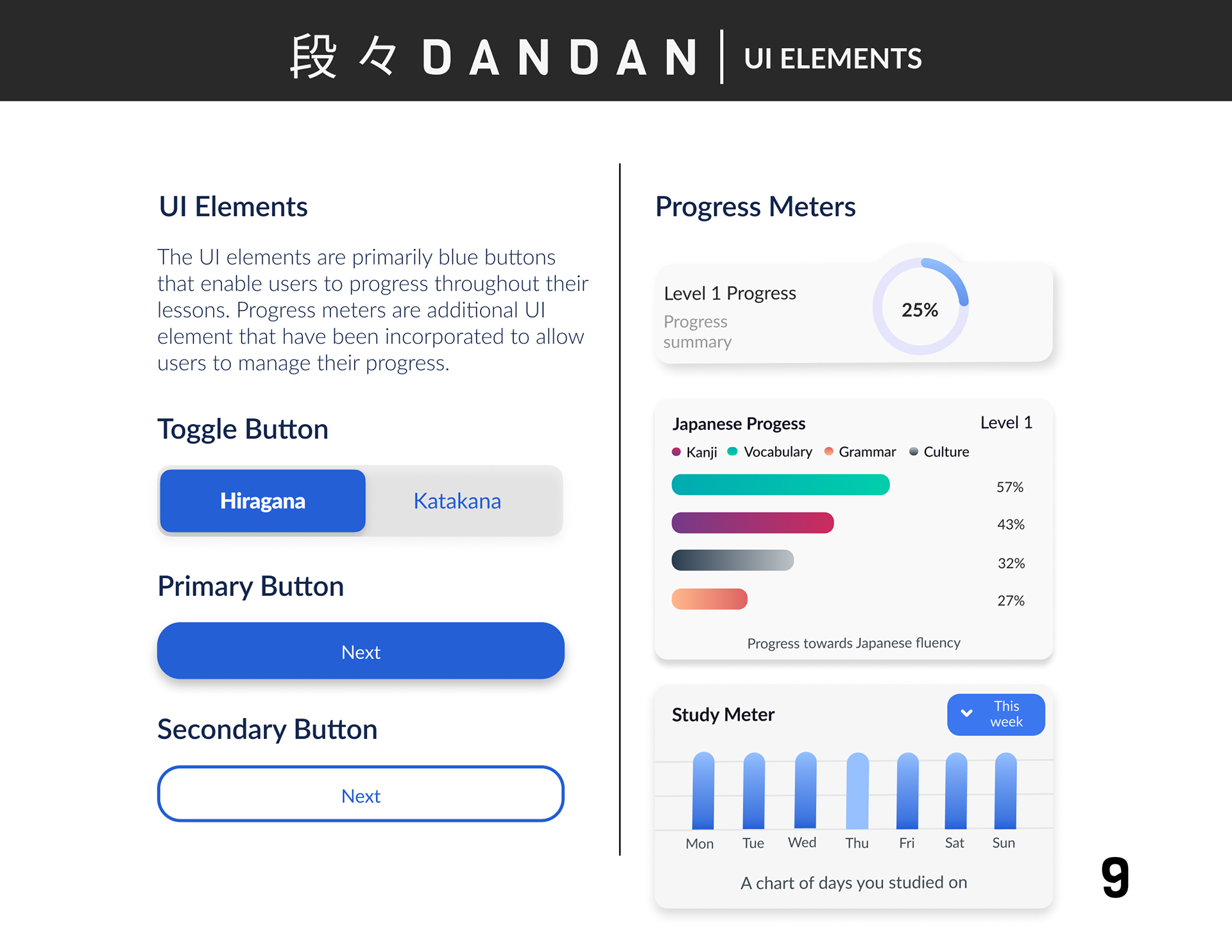
Dandan's UI Elements
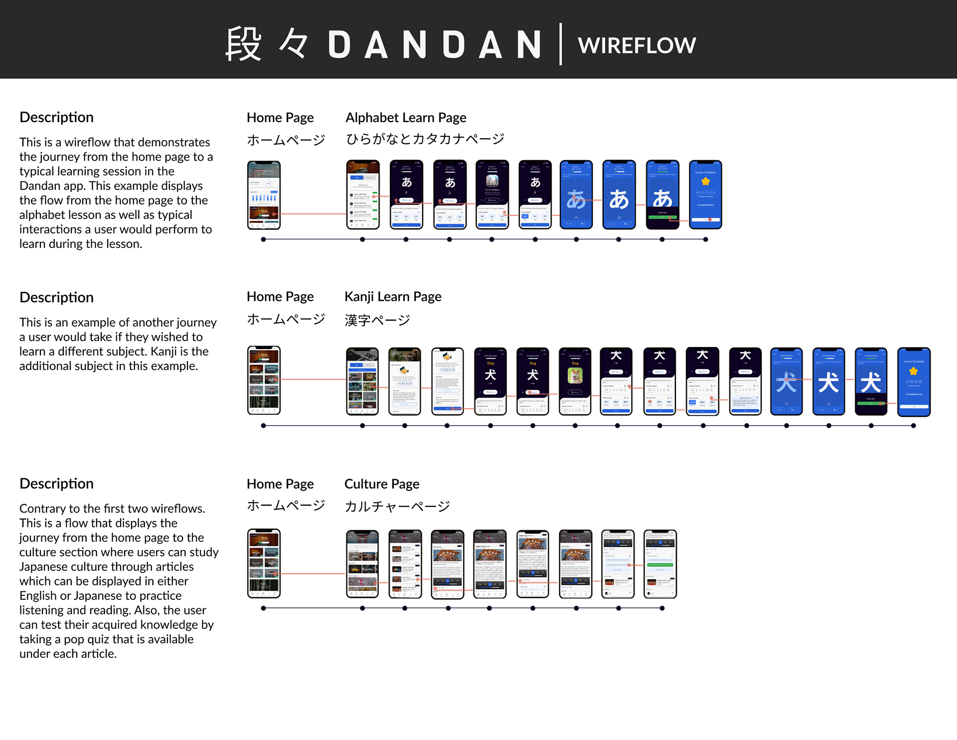
Dandan's wireflow and red routes
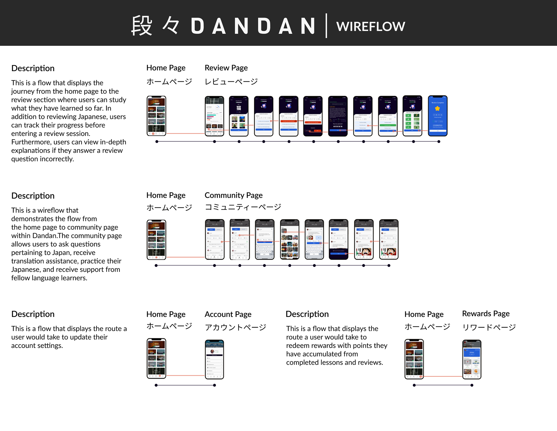
Additional routes of Dandan's wireflow
Final Insights Gained from Usability Testing
The round of usability tests that followed after the creation of the hi-fidelity screens was very insightful because thirteen participants were involved. Since there is a global pandemic and safety is a priority, the tests were conducted online through Figma as well as Zoom so that I could observe each tester as they interacted with my prototype. Each user was presented with prompts and questions that required them to complete relevant tasks to Japanese language learning. One main finding from my testing was that users were not able to have a smooth learning experience due to a combination of the page length and content. Another issue was for users who did not have any experience studying Japanese there were some terminology and symbols that were unrecognizable or difficult to understand for users. The final main issue was during language review sessions, users could not remember which answers they matched together after matching Japanese kanji with corresponding images. Once these issues were highlighted, additional design changes were implemented to resolve them and improve the user experience.
The Solution
"How might we create an interactive experience for language learners and relieve the confusion they feel when reviewing Japanese they are new to learning?" The solution is “Dandan”, a Japanese learning app. The app is composed of five pages, learn, review, community, account, and rewards. The learn page allows users to study many Japanese subjects. During the alphabet lessons, users learn each letter in the correct sequence and practice writing them. Additionally, there is a culture section where users can learn about a variety of cultural topics such as festivals. The review page functions as a section where users can view their progress and review subjects. The community page allows users to ask questions about Japan, receive translation assistance, and receive support from fellow language learners. Following the community page is the account page where the user can adjust their account information. Last is the rewards page which displays redeemable rewards such as discounts to Japanese book stores. In addition to the culture and community pages, this page was very appealing to users who participated in usability tests. The rewards page serves to encourage users studying Japanese to utilize their language capabilities beyond the digital environment in a real-world setting and witness their continuous growth.
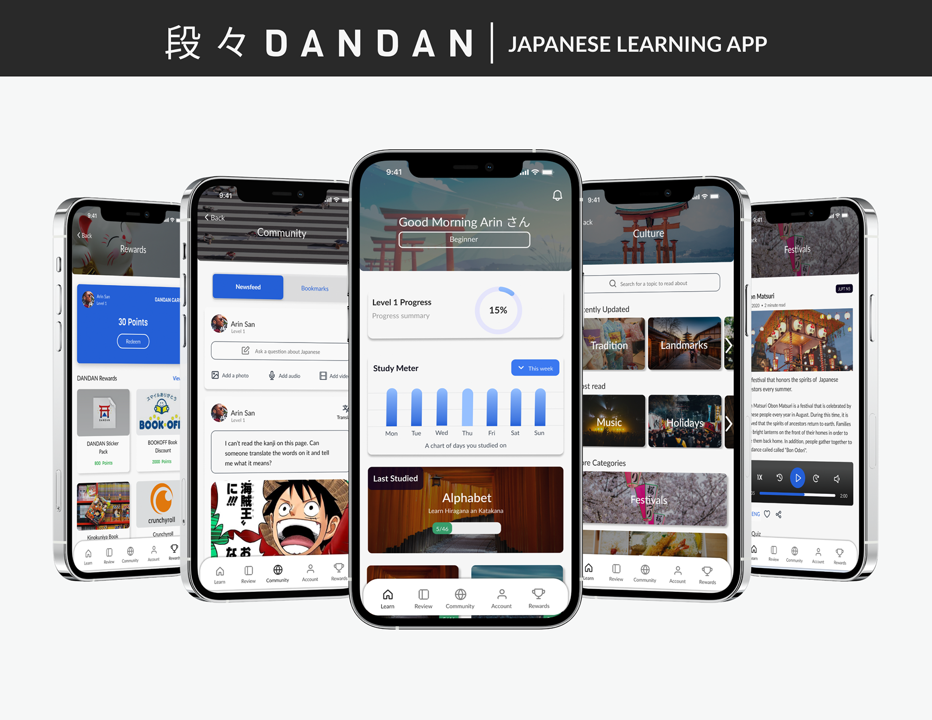
Hi-fidelity screens of Dandan
Quote from "The Solution"
What I Learned
Designing Dandan was an experience that taught me to enjoy the process while also keeping in mind my favorite proverb, "Fall Seven Times, Stand Up Eight." As a designer, this proverb has transformed the way I view design and has enabled me to become even more resilient during my design journey. During this project, many research methods were conducted to acquire relevant information and meaningful insights. It was a process that required me to improve my listening skills, activate my critical thinking skills, and open up my heart to empathize with people. This process demonstrated to me the importance of truly listening to people and without bias. It also reminded me that I am not the user. Therefore, whenever clarification was needed, instead of assuming what a user meant, it became my mission to contact them and ask them to explain further what they meant when reexamining the data from my interviews with them. Lastly, this process also reinforced the fact that UX research is an integral part of the design process because it encourages data-driven design.
Quote from "What I Learned"
Thank you for your time reading this case study. Dandan was made possible thanks to the many individuals who participated in many user interviews and usability tests which I am extremely grateful for. An interactive prototype of Dandan is available below for those who are curious to experience the app.
Here is an image of my workspace. The round figures with faces are known as Daruma. They are a symbol of perseverance and luck in Japan. Daruma are synonymous with my favorite Japanese proverb, “Nana korobi yaoki” (七転び八起き) meaning “fall down seven times, get up eight.”
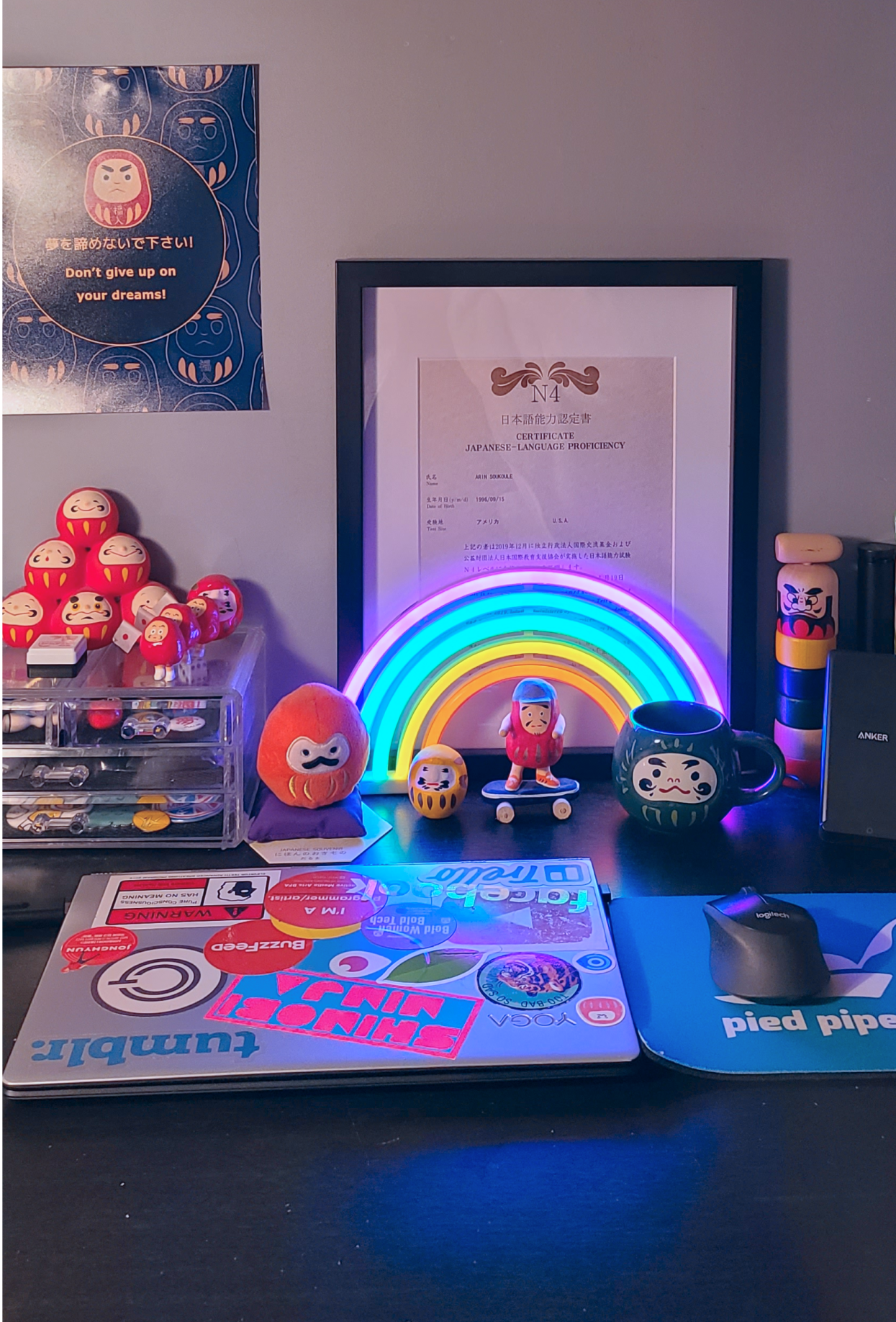
Arin's Workspace