Hi - Fidelity Post UP Mockup
Project Background:
This case study is a solo creation as part of a Google Ventures (GV) design sprint that took place over the course of five days. Additionally, it was pertinent to select a problem to solve through a library provided by BitesizeUX. The selected challenge was to design a mobile experience for freelancers looking to identify a
public location to work at as they complete tasks.
Introduction
Freelance workers who do not have a designated office, struggle to identify suitable locations to work that can accommodate their needs. Upon learning of the problem, it was important to learn more about the difficulties freelancers experienced. According to Chelsea, a graphic designer, there were many circumstances to consider. One issue she faced was needing to identify a quiet place to work and make phone calls. Additionally, due to the nature of Chelsea’s work, she must meet with her clients three times a week. This demand also requires her to travel to different areas of the city that she is unfamiliar with and locate a suitable area to host meetings. Another difficulty for Chelsea was quickly identifying locations with essential amenities.
Freelance workers who do not have a designated office, struggle to identify suitable locations to work that can accommodate their needs. Upon learning of the problem, it was important to learn more about the difficulties freelancers experienced. According to Chelsea, a graphic designer, there were many circumstances to consider. One issue she faced was needing to identify a quiet place to work and make phone calls. Additionally, due to the nature of Chelsea’s work, she must meet with her clients three times a week. This demand also requires her to travel to different areas of the city that she is unfamiliar with and locate a suitable area to host meetings. Another difficulty for Chelsea was quickly identifying locations with essential amenities.
Day 1 Map
To solve this problem, it was useful to create a how might we statement, develop a map of an end-to-end experience, and an affinity map to identify important recurring themes during day one of the sprint.
To solve this problem, it was useful to create a how might we statement, develop a map of an end-to-end experience, and an affinity map to identify important recurring themes during day one of the sprint.
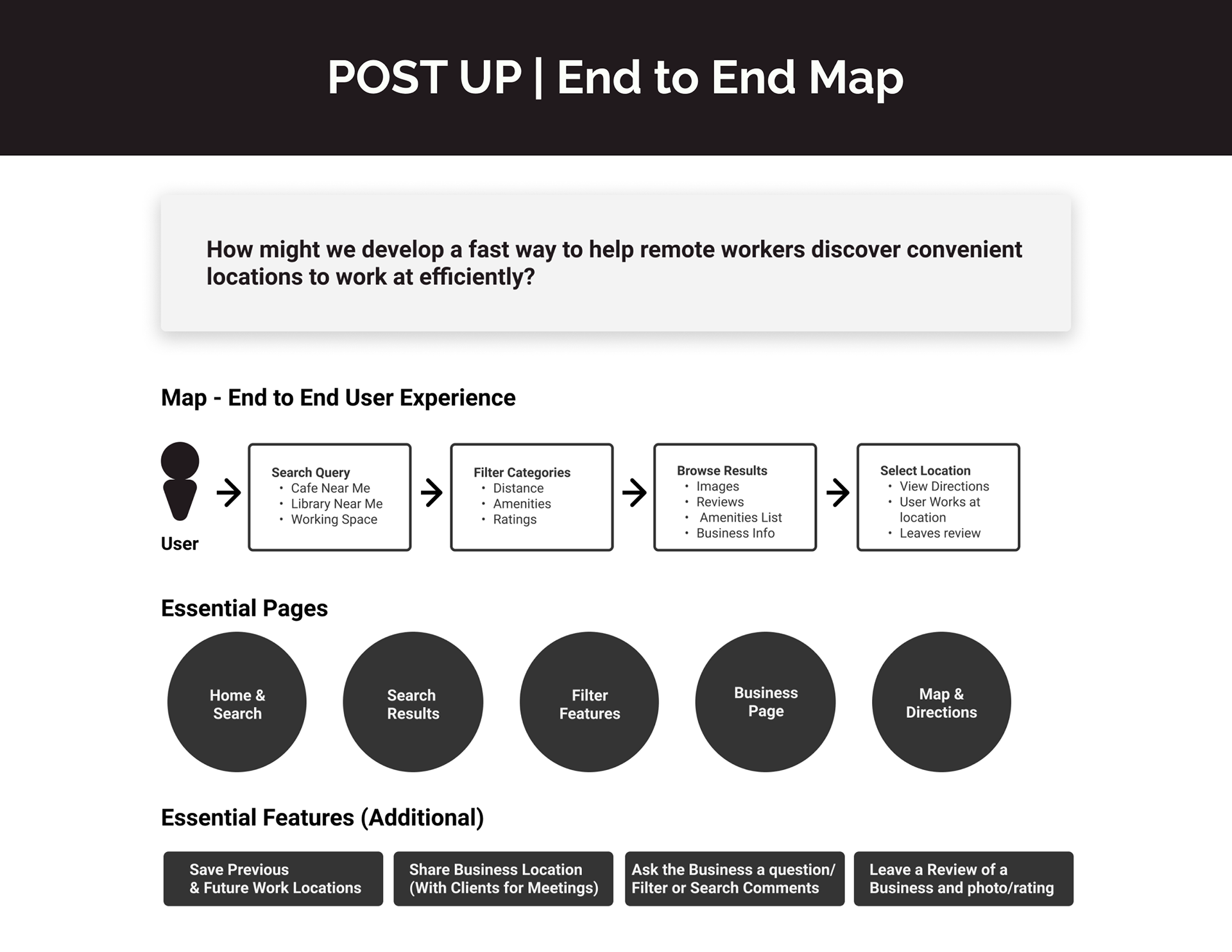
Post UP End to End Map
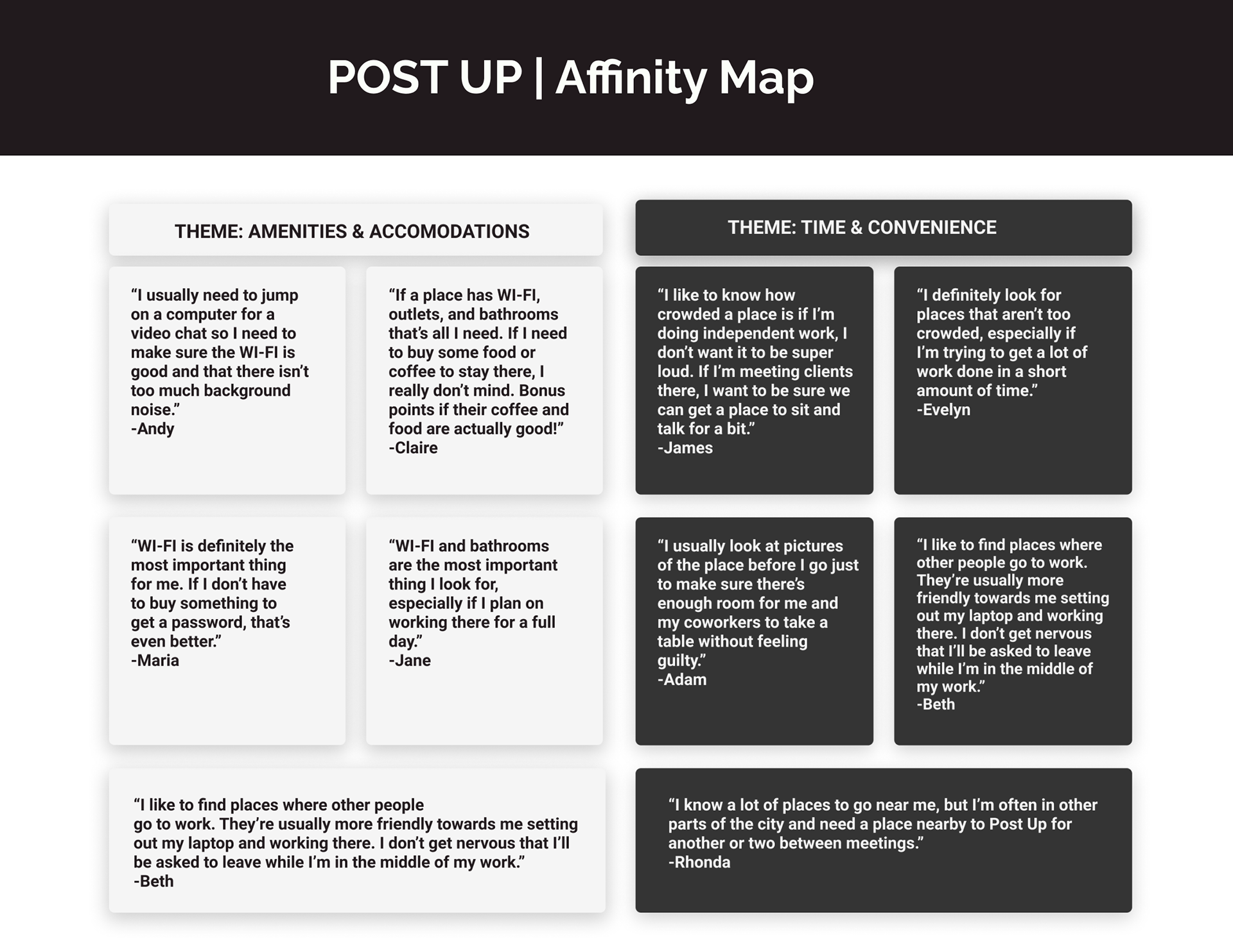
Post UP Affinity Map
Day 2 Sketch
For day two of the sprint, it was important to research current existing products for inspiration. Therefore, Yelp and Google were selected for this purpose. Similarities that were prevalent in both products were features that enabled users to search, sort, and filter factors such as distance, ratings, among many other options. Additionally, both products include images of businesses, essential information, and maps. These were all important aspects that many freelancers often seek to know before settling upon determining a work destination.
Upon acquiring this data, it was important to perform and sketch a lightning demo to analyze and compare the solutions these competitors have produced. After that was completed, conducting a crazy 8’s exercise was the next step to ideating potential solutions. After both of these activities were implemented, it was important to refer to the end-to-end map that was developed during day one of the sprint in order to identify the most critical screen. The most critical screen was the business page because it allows the user to view the most essential information at a glance as well as the address.
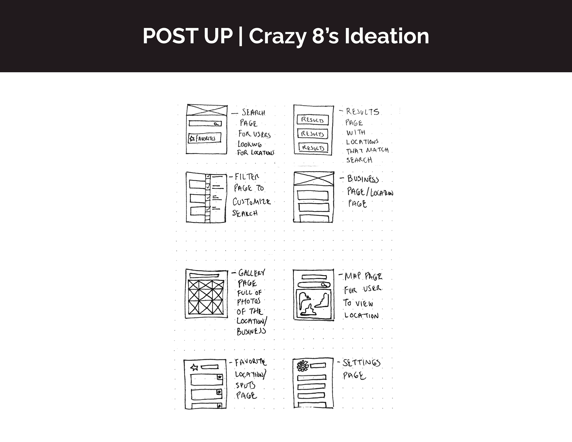
PostUP Crazy 8's Sketches
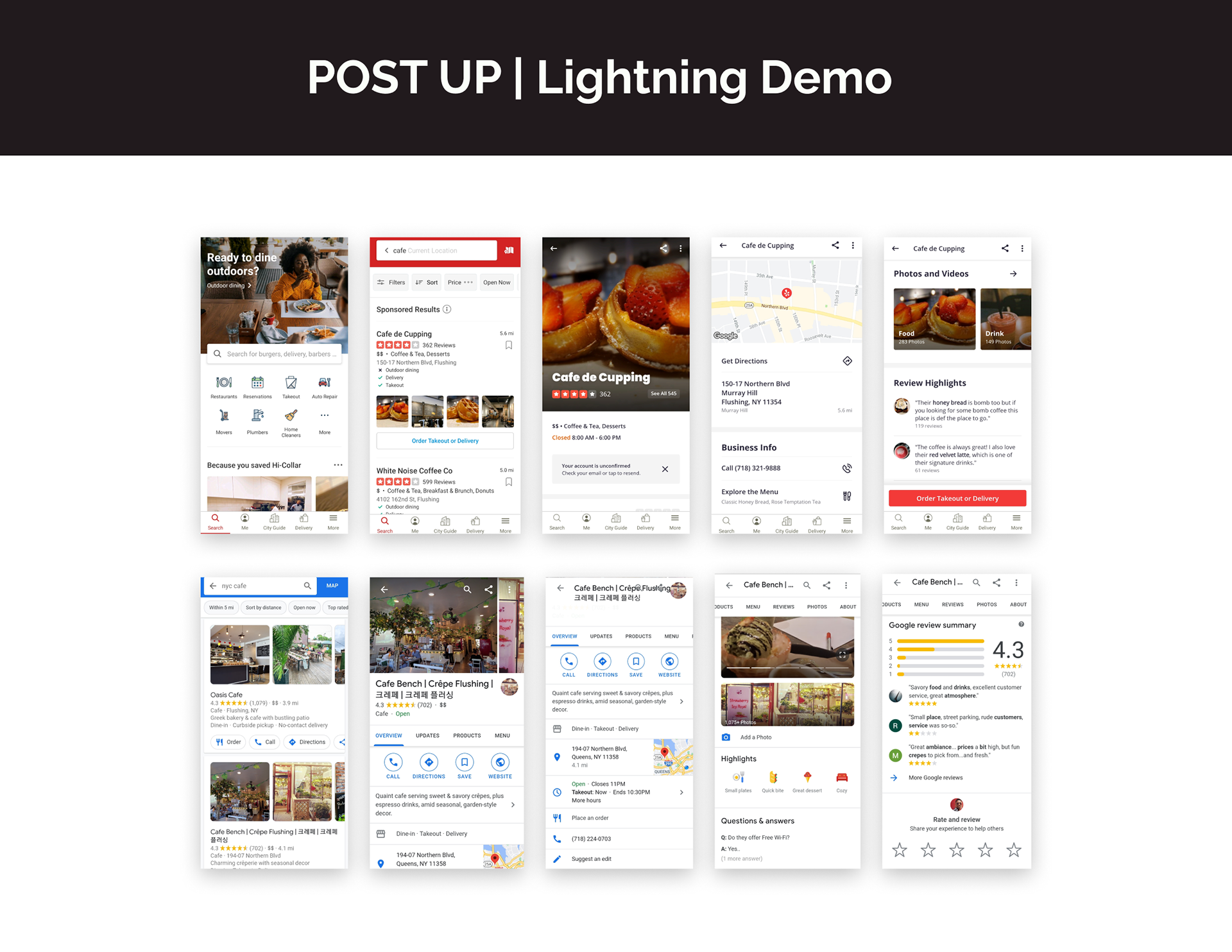
Screenshots of Yelp and Google used for Lightning Demo
Day 3 Decide
Day three consisted of illustrating a storyboard to support the solution that was developed. The Post UP app consists of a starting home page that serves as a search page, a favorites page, an account page, and a settings page. Due to the time constraints many remote workers face, the search page serves as the home page. Once a user has searched for potential locations to work at, the results can be quickly filtered by features such as amenities, distance, and ratings which are of high importance to freelance workers. Additionally, users can view image previews of establishments before selecting a location to consider. Once a user has been matched with the location that best accommodates their needs, they can learn more about the specific area on its page.
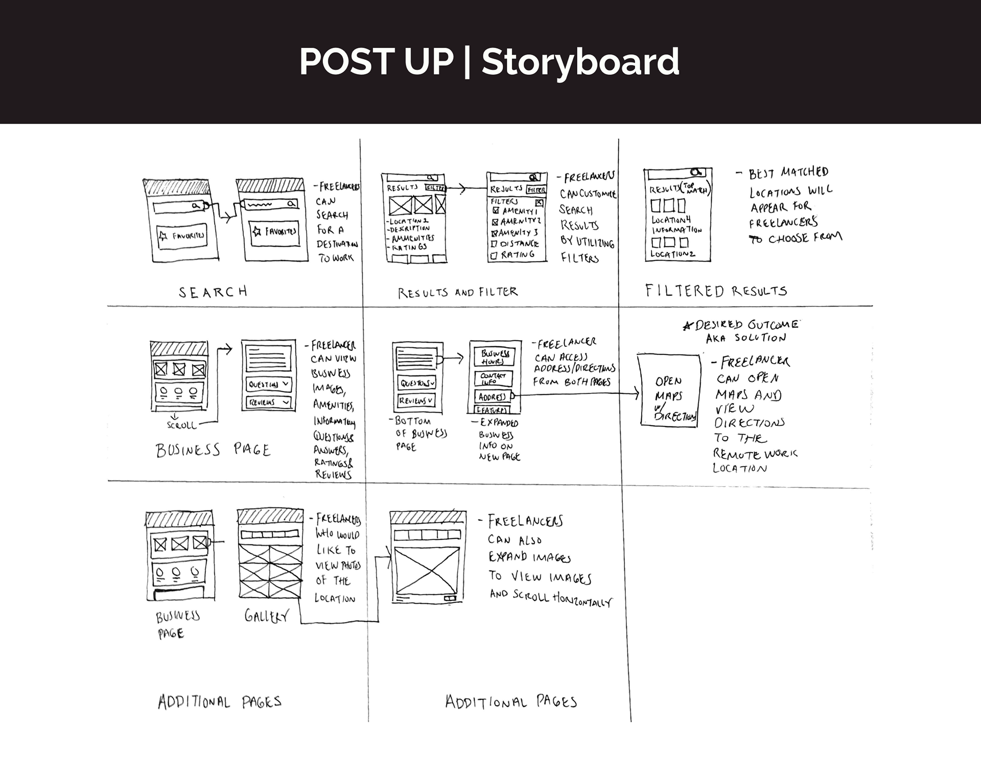
PostUP Storyboard
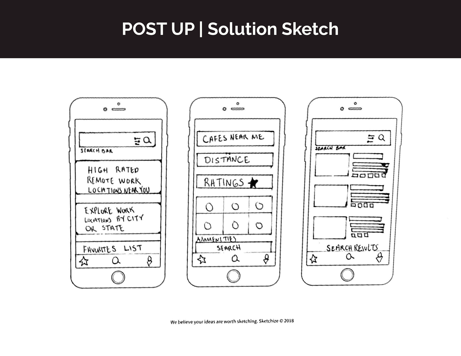
PostUP Solution Sketch Part 1
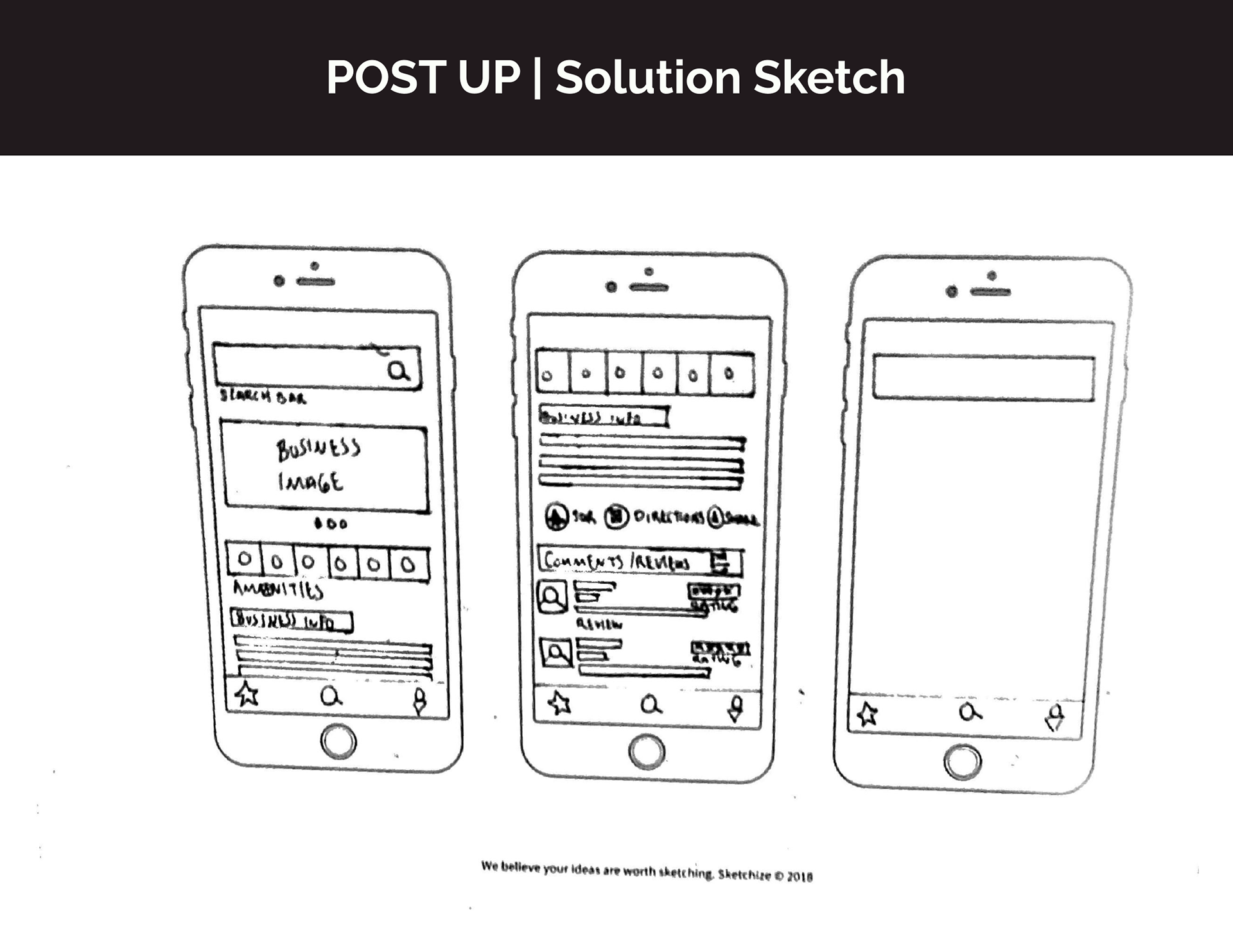
PostUP Solution Sketch Part 2
Day 4 Prototype
Day four of the sprint consisted of creating a prototype of the solution. Initially, a lo-fidelity prototype of the app was created and tested on participants before creating a hi-fidelity version. The lo-fidelity prototype was essential to gaining feedback that would improve the functionality of the design. During the testing sessions, some of the feedback received were comments such as “It would be helpful if I could see more of the businesses information”, “I would like to view the photo gallery”, “Some of the buttons are difficult to select during the filtering process.” This was helpful and enabled me to increase the size of touch targets on the hi-fidelity version of the design, create an expandable business information section, and develop a gallery with relevant imagery among many other design additions. The prototype focuses on the search aspect of the Post UP app and provides information and features necessary for freelancers to view when identifying potential work locations.
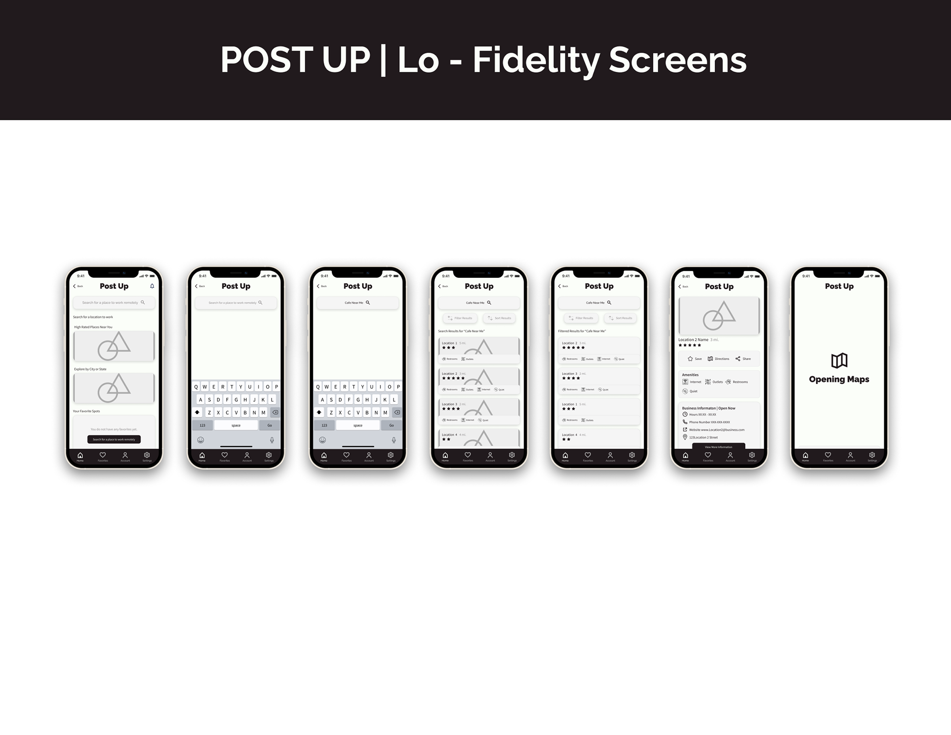
Lo - Fidelity Screens
Day 5 Test
Day five of the sprint was reserved for testing the prototype to identify potential areas of the design to
strengthen and improve. During the first test, the main issue that occurred was with locating the gallery section that was initially at the bottom of the page. This proved to be an issue in later tests and led to the repositioning of the gallery to the top of the page. During a second usability test, the primary issue that occurred was in the gallery page. There was no indication of which number photo the user was viewing and it was confusing. To improve this, a counter was included on the page for the user to view the image count as well as the number that was being viewed. During the third testing session, the tester found the experience simple and easy to navigate however noted that it would be beneficial to include a section for the freelancer to view a log of favorite spots. During the fourth testing session, the tester also found the experience easy to navigate however, experiences were issued during the filtering process for not being able to select each selection. This required me to explain that the prototype was set up this way due to time constraints. As for the last session, the tester also navigated the experience with ease and recommended relocating the share and like icons because they were in an unusual spot. This prompted me to resolve the issue by relocating the mentioned icons to a higher area of the wireframe.
strengthen and improve. During the first test, the main issue that occurred was with locating the gallery section that was initially at the bottom of the page. This proved to be an issue in later tests and led to the repositioning of the gallery to the top of the page. During a second usability test, the primary issue that occurred was in the gallery page. There was no indication of which number photo the user was viewing and it was confusing. To improve this, a counter was included on the page for the user to view the image count as well as the number that was being viewed. During the third testing session, the tester found the experience simple and easy to navigate however noted that it would be beneficial to include a section for the freelancer to view a log of favorite spots. During the fourth testing session, the tester also found the experience easy to navigate however, experiences were issued during the filtering process for not being able to select each selection. This required me to explain that the prototype was set up this way due to time constraints. As for the last session, the tester also navigated the experience with ease and recommended relocating the share and like icons because they were in an unusual spot. This prompted me to resolve the issue by relocating the mentioned icons to a higher area of the wireframe.
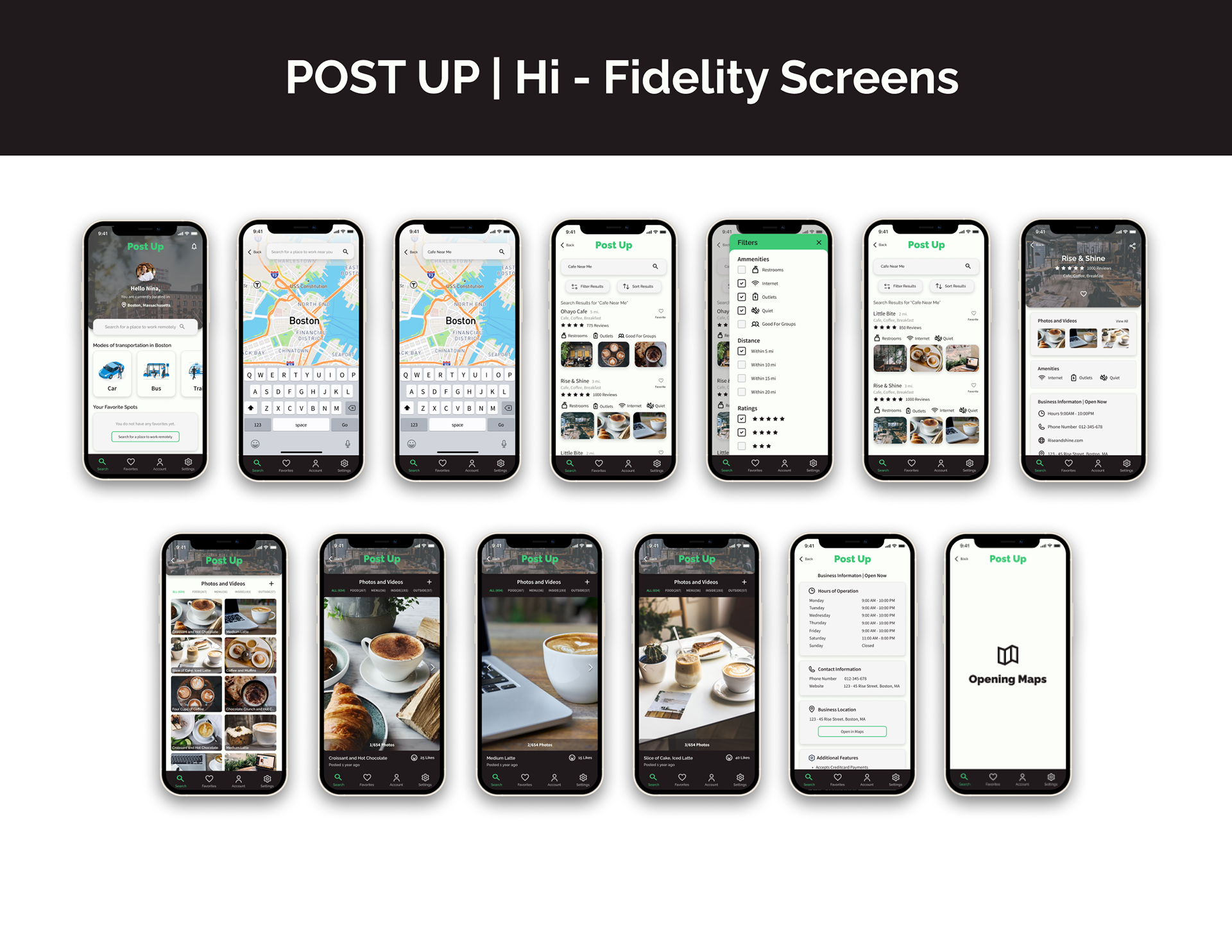
Hi - Fidelity Screens
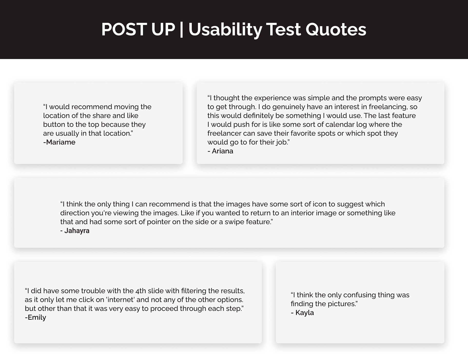
Usability Test Quotes
Takeaways
Completing the design sprint reinforced my understanding of the UX design process. This experience required me to discover and define a problem, ideate, and prototype a solution, and test it with users in a short amount of time. Additionally from this experience, I have learned the purpose of the sprint is not to produce a perfect product but instead to develop a good solution that addresses the users needs. Furthermore, sketching an end-to-end map and performing the lightning demo exercises helped identify the most critical screen to design for and ultimately map out the design layout. One aspect of the spirit that I would not repeat is performing the crazy 8’s exercise solo. It would be helpful to have an additional peer to brainstorm more possible innovative solutions.
Post UP Video Demo